Correlation matrix
Correlation matrix#
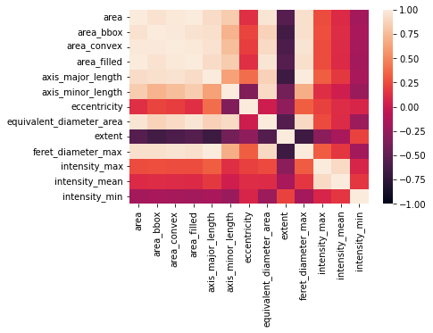
In practice (particularly in image analysis) we often calculate a large variety of features that may often be strongly correlated with other features. The introduced correlation coefficients can help us to identify groups of redundant features.
from skimage import data, filters, measure
import pandas as pd
import matplotlib.pyplot as plt
import seaborn as sns
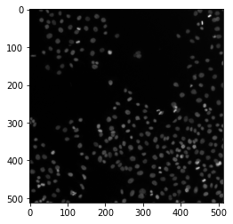
image = data.human_mitosis()
fig, ax = plt.subplots()
ax.imshow(image, cmap='gray')
<matplotlib.image.AxesImage at 0x2481148dbe0>
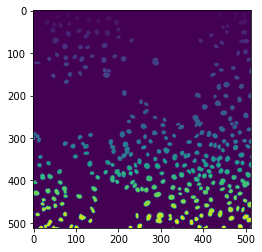
binary = image > filters.threshold_otsu(image)
labels = measure.label(binary)
fig, ax = plt.subplots()
ax.imshow(labels)
<matplotlib.image.AxesImage at 0x2481636d910>
props = measure.regionprops_table(labels, intensity_image=image, properties=['area', 'area_bbox', 'area_convex',
                                                                    'area_filled', 'axis_major_length',
                                                                    'axis_minor_length', 'eccentricity',
                                                                    'equivalent_diameter_area', 'extent',
                                                                    'feret_diameter_max', 'intensity_max',
                                                                    'intensity_mean', 'intensity_min'])
df = pd.DataFrame(props)
df
| area | area_bbox | area_convex | area_filled | axis_major_length | axis_minor_length | eccentricity | equivalent_diameter_area | extent | feret_diameter_max | intensity_max | intensity_mean | intensity_min | |
|---|---|---|---|---|---|---|---|---|---|---|---|---|---|
| 0 | 62 | 70 | 63 | 62 | 10.571311 | 7.557049 | 0.699264 | 8.884866 | 0.885714 | 10.770330 | 63.0 | 50.645161 | 40.0 |
| 1 | 7 | 7 | 7 | 7 | 8.000000 | 0.000000 | 1.000000 | 2.985411 | 1.000000 | 7.000000 | 68.0 | 58.285714 | 39.0 |
| 2 | 121 | 143 | 124 | 121 | 13.746529 | 11.516064 | 0.546064 | 12.412171 | 0.846154 | 14.317821 | 82.0 | 61.487603 | 39.0 |
| 3 | 19 | 24 | 20 | 19 | 6.674754 | 3.805741 | 0.821527 | 4.918491 | 0.791667 | 6.708204 | 78.0 | 58.473684 | 39.0 |
| 4 | 62 | 80 | 65 | 62 | 11.482908 | 6.872199 | 0.801144 | 8.884866 | 0.775000 | 11.661904 | 86.0 | 63.387097 | 42.0 |
| ... | ... | ... | ... | ... | ... | ... | ... | ... | ... | ... | ... | ... | ... |
| 288 | 45 | 60 | 48 | 45 | 11.333091 | 5.339585 | 0.882053 | 7.569398 | 0.750000 | 12.041595 | 102.0 | 78.533333 | 42.0 |
| 289 | 49 | 90 | 61 | 49 | 18.128803 | 4.509369 | 0.968570 | 7.898654 | 0.544444 | 18.027756 | 100.0 | 73.387755 | 40.0 |
| 290 | 39 | 50 | 42 | 39 | 9.496172 | 5.480726 | 0.816637 | 7.046726 | 0.780000 | 10.049876 | 87.0 | 66.000000 | 39.0 |
| 291 | 4 | 4 | 4 | 4 | 4.472136 | 0.000000 | 1.000000 | 2.256758 | 1.000000 | 4.000000 | 59.0 | 53.750000 | 45.0 |
| 292 | 4 | 4 | 4 | 4 | 4.472136 | 0.000000 | 1.000000 | 2.256758 | 1.000000 | 4.000000 | 41.0 | 40.250000 | 39.0 |
293 rows × 13 columns
We can calculate a correlation matrix using a given correlation metric with pandas:
correlation_matrix = df.corr(method='pearson')
It seems obvious that there is quite a large number of features that are strongly connected to each other - Seaborn offers the heatmap function for this:
ax = sns.heatmap(correlation_matrix, annot=False, vmin=-1, vmax=1)
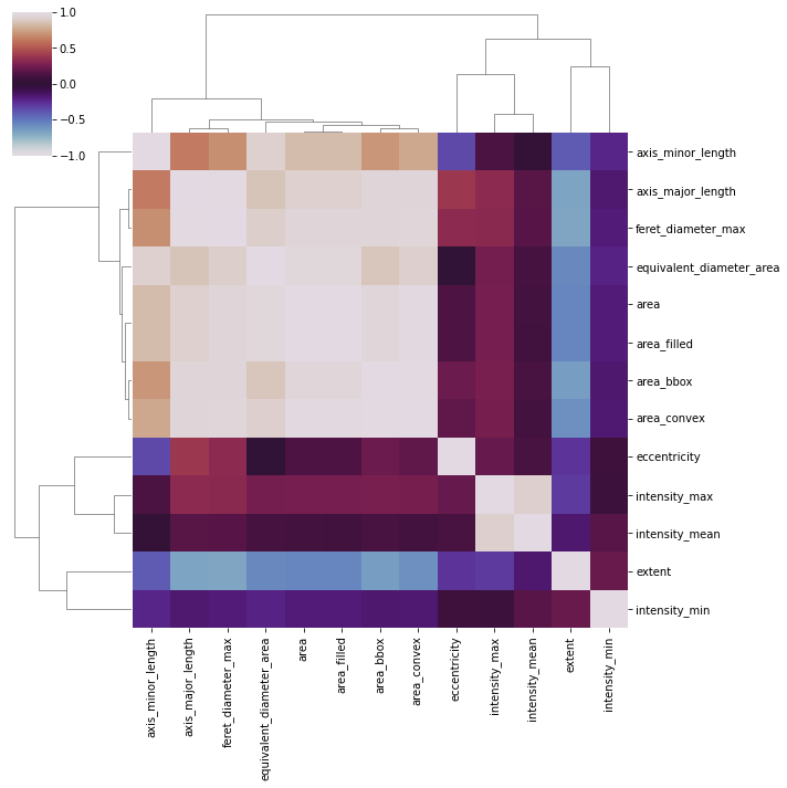
Maybe we can make this even clearer by rearranging some of the columns/rows. We can use the seaborn clustermap feature for this:
fig = sns.clustermap(correlation_matrix, vmin=-1, vmax=1, cmap='twilight')