Introduction to Seaborn
Contents
Introduction to Seaborn#
The definition of seaborn’s website is so concise that we replicate it here:
“Seaborn is a library for making statistical graphics in Python. It builds on top of matplotlib and integrates closely with pandas data structures.”
That’s it! The main benefit of using it is that it is a more high-level library, which means we can achieve sophisticated plots with much less lines of code. Most axes style customization are done automatically. It can automatically provide plots with summary statistics.
import pandas as pd
import numpy as np
import matplotlib.pyplot as plt
import seaborn as sns
We will apply the seaborn default theme, but you can choose others here.
sns.set_theme()
Scatter plots with seaborn#
Let’s load the same dataframe.
df = pd.read_csv("../../data/BBBC007_analysis.csv")
df.head()
| area | intensity_mean | major_axis_length | minor_axis_length | aspect_ratio | file_name | |
|---|---|---|---|---|---|---|
| 0 | 139 | 96.546763 | 17.504104 | 10.292770 | 1.700621 | 20P1_POS0010_D_1UL |
| 1 | 360 | 86.613889 | 35.746808 | 14.983124 | 2.385805 | 20P1_POS0010_D_1UL |
| 2 | 43 | 91.488372 | 12.967884 | 4.351573 | 2.980045 | 20P1_POS0010_D_1UL |
| 3 | 140 | 73.742857 | 18.940508 | 10.314404 | 1.836316 | 20P1_POS0010_D_1UL |
| 4 | 144 | 89.375000 | 13.639308 | 13.458532 | 1.013432 | 20P1_POS0010_D_1UL |
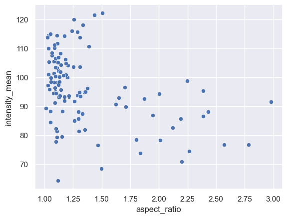
And make a scatter plot of aspect_ratio vs intensity mean.
sns.scatterplot(data=df, x="aspect_ratio", y="intensity_mean")
<AxesSubplot: xlabel='aspect_ratio', ylabel='intensity_mean'>
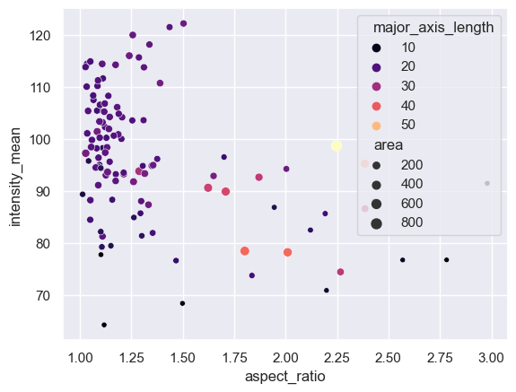
We can already embbed and visualize other features by providing a few extra arguments.
sns.scatterplot(data=df,
            x = "aspect_ratio",
            y = "intensity_mean",
            size = "area",
            hue = "major_axis_length",
            palette = 'magma')
<AxesSubplot: xlabel='aspect_ratio', ylabel='intensity_mean'>
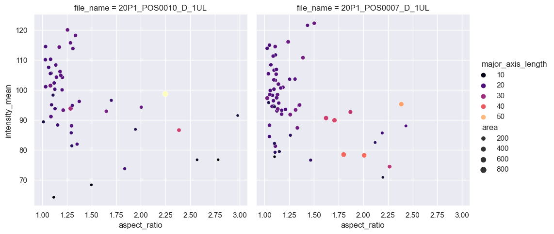
Scatter plots with subplots#
The scatterplot function is an axes-level function. This means, if we want to add subplots, we also need to create figure and axes from matplotlib first and pass the axes handles. That’s when knowing some matplotlib syntax may be handy!
However, seaborn also have figure-level functions, where the subplots are also just an argument.
In the example below, we use the relplot function (from relationship) and separate the files by providing ‘file_name’ to the argument col,
sns.relplot(data=df,
            x = "aspect_ratio",
            y = "intensity_mean",
            size = "area",
            hue = "major_axis_length",
            col = "file_name",
            palette = 'magma')
<seaborn.axisgrid.FacetGrid at 0x24aa593d820>
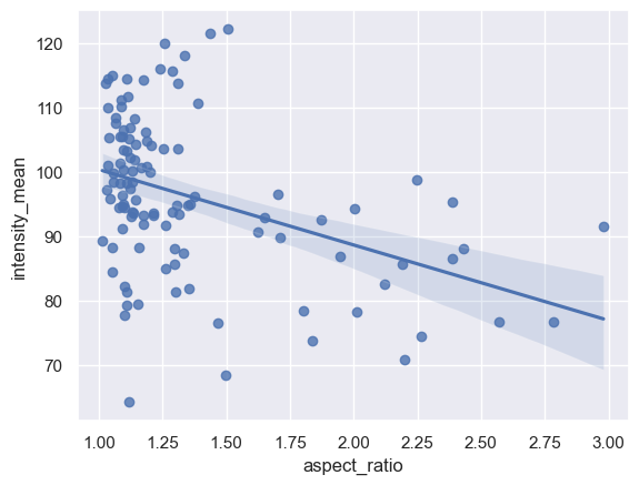
Adding a line regression model#
There are two functions to make a scatter plot with a line regression model: regplot and lmplot. As before, regplot is an axes-level funtion while lmplot is a figure-level function.
Let’s plot an example of each of them
sns.regplot(data = df, x = "aspect_ratio", y = "intensity_mean")
<AxesSubplot: xlabel='aspect_ratio', ylabel='intensity_mean'>
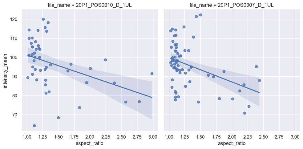
Line Regression with subplots#
sns.lmplot(data = df,
           x = "aspect_ratio",
           y = "intensity_mean",
           col = "file_name")
<seaborn.axisgrid.FacetGrid at 0x24aa5a4aa00>
Exercise#
Plot a line regression model on a single plot, with points and lines having different colors according to ‘file_name’.
Hint: use a function that accepts a hue argument