Multivariate views
Contents
Multivariate views#
In this notebook, we show a few examples of how to have plots with graphs of different types in a figure, like having a scatter plot with marginal distributions or even a multivariate plot with pair relationships of all properties in a table.
Because these plots involve managing subplots, they are all figure-level functions.
import pandas as pd
import numpy as np
import matplotlib.pyplot as plt
import seaborn as sns
sns.set_theme()
Let’s load the same dataframe.
df = pd.read_csv("../../data/BBBC007_analysis.csv")
df.head()
| area | intensity_mean | major_axis_length | minor_axis_length | aspect_ratio | file_name | |
|---|---|---|---|---|---|---|
| 0 | 139 | 96.546763 | 17.504104 | 10.292770 | 1.700621 | 20P1_POS0010_D_1UL |
| 1 | 360 | 86.613889 | 35.746808 | 14.983124 | 2.385805 | 20P1_POS0010_D_1UL |
| 2 | 43 | 91.488372 | 12.967884 | 4.351573 | 2.980045 | 20P1_POS0010_D_1UL |
| 3 | 140 | 73.742857 | 18.940508 | 10.314404 | 1.836316 | 20P1_POS0010_D_1UL |
| 4 | 144 | 89.375000 | 13.639308 | 13.458532 | 1.013432 | 20P1_POS0010_D_1UL |
Plotting joint and marginal distributions#
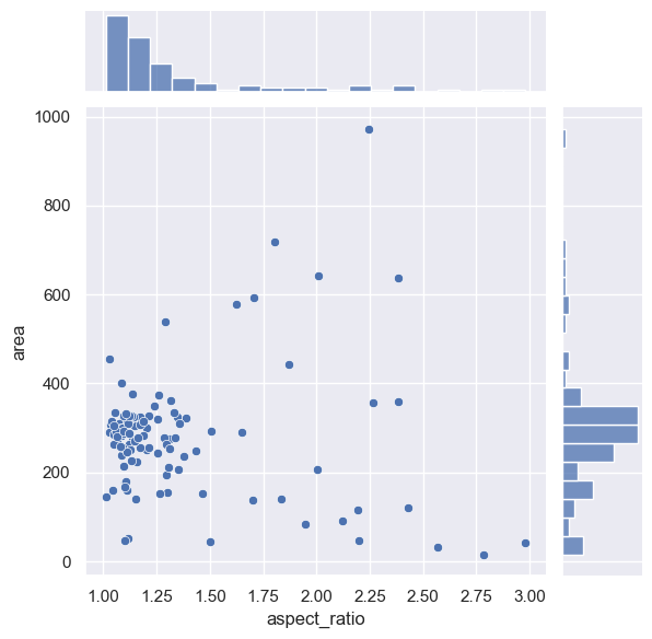
To have a joint distribution of two variableswith the marginal distributions on the sides, we can use jointplot.
sns.jointplot(data=df, x="aspect_ratio", y="area")
<seaborn.axisgrid.JointGrid at 0x20aa156d070>
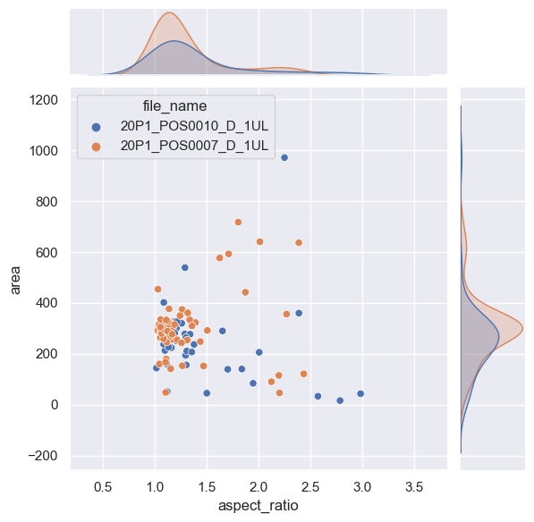
As expected, it is possible to separate groups by passing a categorical property to the hue argument. This has an effect on the marginal distribution, turning them from histogram to kde plots.
sns.jointplot(data=df, x="aspect_ratio", y="area", hue = 'file_name')
<seaborn.axisgrid.JointGrid at 0x20aa1574ca0>
Plotting many distributions at once#
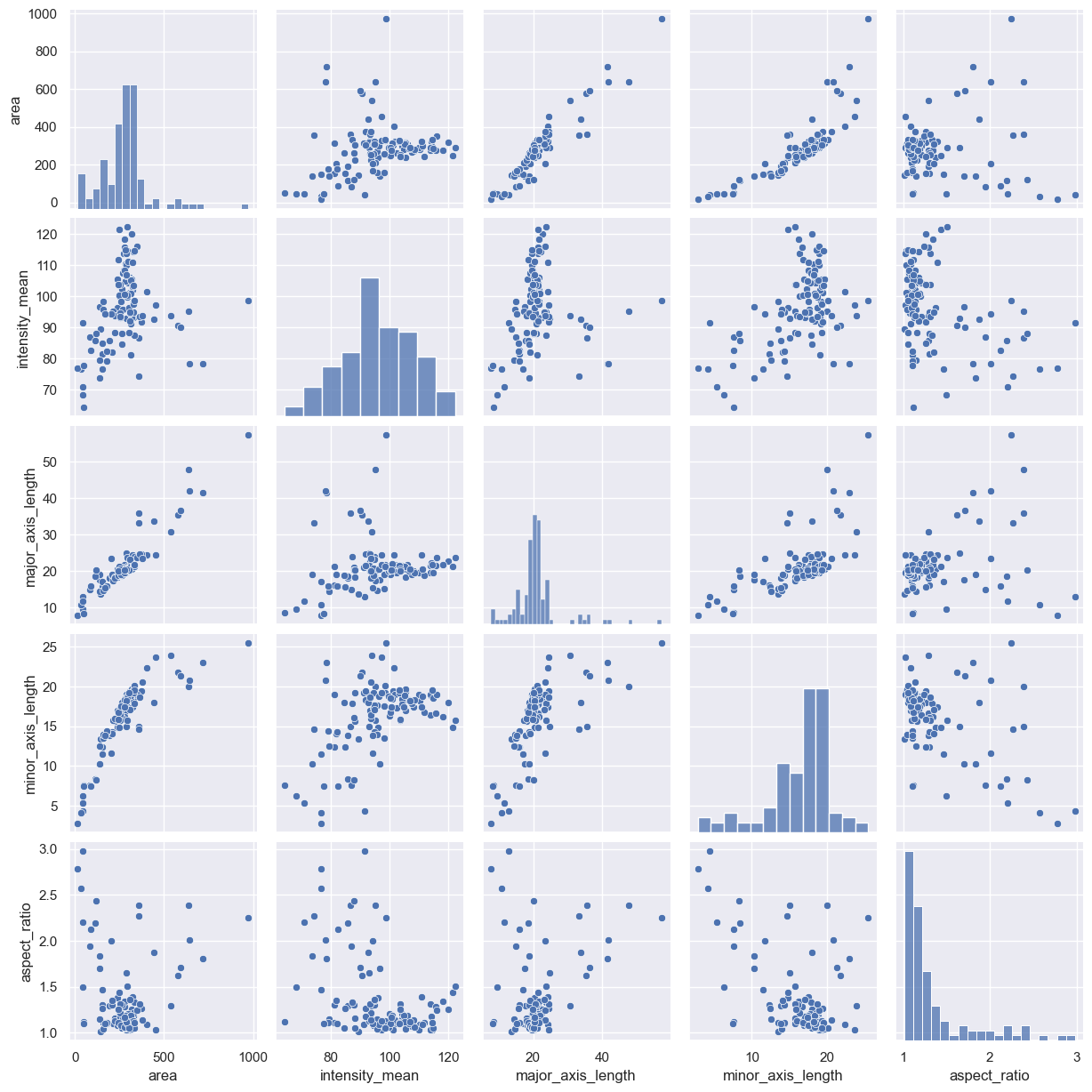
The above examples displayed a plot with relationship between two properties. This can be further expanded with the pairplot function
sns.pairplot(data=df)
<seaborn.axisgrid.PairGrid at 0x20aa76121f0>
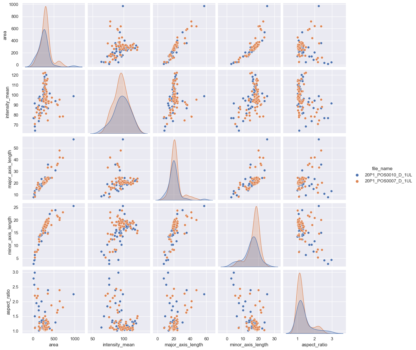
sns.pairplot(data=df, hue="file_name")
<seaborn.axisgrid.PairGrid at 0x20aa892e070>
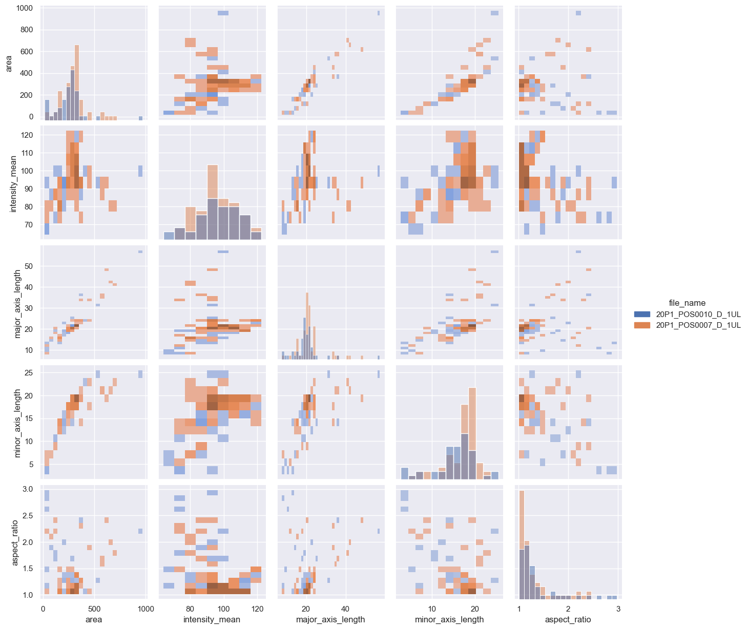
If you have too many points, displaying every single point may yield graphs too poluted. An alternative visualization in this case could be a 2D histogram plot. We can do that by changing the kind argument to “hist”.
sns.pairplot(data=df, hue="file_name", kind = "hist")
<seaborn.axisgrid.PairGrid at 0x20abbf7d4f0>
Exercise#
You may have noticed that the pairplot is redundant in some plots because the upper diagonal displays the same relationships rotated.
Redraw the pairplot to display only the lower diagonal of the plots.
Hint: explore the properties of the pairplot