Plotting Data with Matplotlib
Contents
Plotting Data with Matplotlib#
Data, be it images or object features, can and must be plotted for a better understanding of their properties or relationships. We already saw that we can use napari to interactively visualize images. Sometimes, we may want to have a static view inside a notebook to consistently share with collaborators or as material in a publication.
Python has many libraries for plotting data, like matplotlib, seaborn, plotly and bokeh, to name a few. Some libraries ship plotting function inside them as a convenience. For example, the pandas method .plot can plot graphs directly from dataframes.
In this notebook, we will explain the basics of Matplotlib, probably the most flexible and traditional library to display images and data in Python.
Knowing a bit of its syntax help understanding other higher level libraries.
import pandas as pd
import numpy as np
from skimage.io import imread
import matplotlib.pyplot as plt
Reading data#
In this notebook, we will use an image and a table to plot. Let’s read them.
The table contains continuous data from 2 images, identified by the last categorical column ‘file_name’.
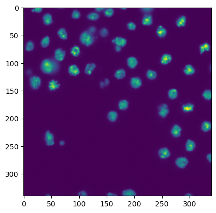
image1 = imread("../../data/BBBC007_batch/20P1_POS0010_D_1UL.tif")

df = pd.read_csv("../../data/BBBC007_analysis.csv")
df.head(5)
| area | intensity_mean | major_axis_length | minor_axis_length | aspect_ratio | file_name | |
|---|---|---|---|---|---|---|
| 0 | 139 | 96.546763 | 17.504104 | 10.292770 | 1.700621 | 20P1_POS0010_D_1UL |
| 1 | 360 | 86.613889 | 35.746808 | 14.983124 | 2.385805 | 20P1_POS0010_D_1UL |
| 2 | 43 | 91.488372 | 12.967884 | 4.351573 | 2.980045 | 20P1_POS0010_D_1UL |
| 3 | 140 | 73.742857 | 18.940508 | 10.314404 | 1.836316 | 20P1_POS0010_D_1UL |
| 4 | 144 | 89.375000 | 13.639308 | 13.458532 | 1.013432 | 20P1_POS0010_D_1UL |
Plotting an image with matplotlib#
To start, we briefly recap how we display images. You just need a single line:
plt.imshow(image1)
<matplotlib.image.AxesImage at 0x146054f40>
Plotting a graph with matplotlib#
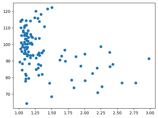
To plot a graph with matplotlib, like a scatter plot, we need to get the data from the table and feed it to plt.scatter.
Let’s plot the aspect_ratio vs mean_intensity.
x = df['aspect_ratio']
y = df['intensity_mean']
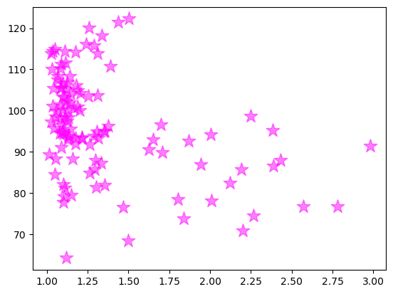
plt.scatter(x, y)
<matplotlib.collections.PathCollection at 0x146167cd0>
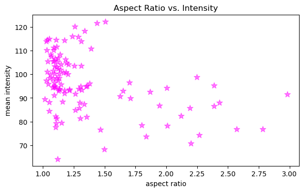
In a similar fashion, it is possible to provide extra arguments to customize plots like this. Below, we change the marker symbol, marker size (s), color and make marker half transparent (alpha).
fig, ax = plt.subplots(figsize=(7,4))
ax.scatter(x, y, color='magenta', marker='*', s=80, alpha=0.5)
ax.set_xlabel('aspect ratio')
ax.set_ylabel('mean intensity')
ax.set_title('Aspect Ratio vs. Intensity')
Text(0.5, 1.0, 'Aspect Ratio vs. Intensity')
Configuring figure and axes#
Besides plotting graphs as shown above, we usually want to furhter configure the figure and its axes, like provide the names to the axes, change the figure size and maybe have more than one plot in the same figure.
To be able to do all that and more, it is necessary to have handles: variables that represent the figure and the axes objects. We can have access to them by, before plotting, creating an empty figure with the function plt.subplots.
fig, ax = plt.subplots()
Let’s add our plot to this new figure. We now do that by passing the scatter function as an axes method.
fig, ax = plt.subplots()
ax.scatter(x, y, color = 'magenta', marker = '*', s = 200, alpha = 0.5)
<matplotlib.collections.PathCollection at 0x14621dd60>
OK, we got the same figure back, so what?
The difference is that now we have access to the figure handles! This adds a lot of editability.
Let’s give axes proper names, put a title and increase the figure size.
Note: the default figure size is [6.4, 4.8] inches (width, height)
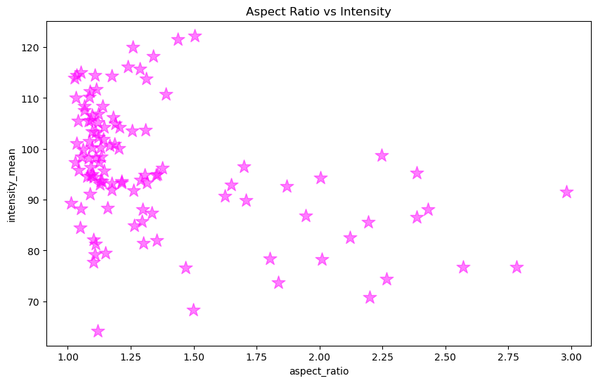
fig, ax = plt.subplots(figsize = [10,6])
ax.scatter(x, y, color = 'magenta', marker = '*', s = 200, alpha = 0.5)
ax.set_xlabel('aspect_ratio')
ax.set_ylabel('intensity_mean')
ax.set_title('Aspect Ratio vs Intensity')
Text(0.5, 1.0, 'Aspect Ratio vs Intensity')
Subplots#
So far we are plotting one image or graph per figure containing all the data.
We could also make a grid plot by providing the number of rows and columns of the grid to plt.subplots
fig, ax = plt.subplots(1,2, figsize = [10,6])
ax
array([<AxesSubplot: >, <AxesSubplot: >], dtype=object)
Now our axes has two elements because we specified 1 row and 2 columns.
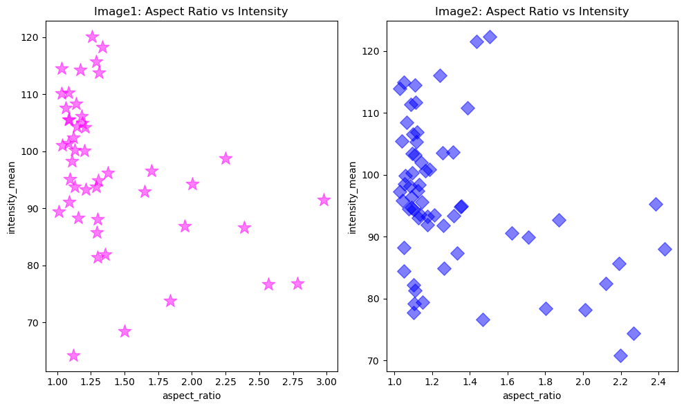
Imagine each file was a different experimental group. We can now plot the same relationship, separated by image file on different axes, but in the same figure.
First, we get data separated by ‘file_name’.
# Aspect ratio and intensity where 'file_name' equals first file name
x1 = df[df['file_name'] == '20P1_POS0010_D_1UL']['aspect_ratio']
y1 = df[df['file_name'] == '20P1_POS0010_D_1UL']['intensity_mean']

# Aspect ratio and intensity where 'file_name' equals second file name
x2 = df[df['file_name'] == '20P1_POS0007_D_1UL']['aspect_ratio']
y2 = df[df['file_name'] == '20P1_POS0007_D_1UL']['intensity_mean']
Then, specify an index to the axes to indicate which axis will get the plot.
# Get major_axis_length from table
major_axis_length = df['major_axis_length']
# Create empty figure and axes grid
fig, ax = plt.subplots(1,2, figsize = [10,6])
# Configure plot and properties of first axis
ax[0].scatter(x1, y1, color = 'magenta', marker = '*', s = 200, alpha = 0.5)
ax[0].set_xlabel('aspect_ratio')
ax[0].set_ylabel('intensity_mean')
ax[0].set_title('Image1: Aspect Ratio vs Intensity')

# Configure plot and properties of second axis
ax[1].scatter(x2, y2, color = 'blue', marker = 'D', s = 100, alpha = 0.5)
ax[1].set_xlabel('aspect_ratio')
ax[1].set_ylabel('intensity_mean')
ax[1].set_title('Image2: Aspect Ratio vs Intensity')

# Hint: this command in the end is very useful when axes labels overlap
plt.tight_layout()
Introduction to Seaborn#
The definition of seaborn’s website is so concise that we replicate it here:
“Seaborn is a library for making statistical graphics in Python. It builds on top of matplotlib and integrates closely with pandas data structures.”
That’s it! The main benefit of using it is that it is a more high-level library, which means we can achieve sophisticated plots with much less lines of code. Most axes style customization are done automatically. It can automatically provide plots with summary statistics.
import seaborn as sns
We will apply the seaborn default theme, but you can choose others here.
sns.set_theme(style="ticks")
Scatter plots with seaborn#
Let’s load the same dataframe.
df = pd.read_csv("../../data/BBBC007_analysis.csv")
df.head()
| area | intensity_mean | major_axis_length | minor_axis_length | aspect_ratio | file_name | |
|---|---|---|---|---|---|---|
| 0 | 139 | 96.546763 | 17.504104 | 10.292770 | 1.700621 | 20P1_POS0010_D_1UL |
| 1 | 360 | 86.613889 | 35.746808 | 14.983124 | 2.385805 | 20P1_POS0010_D_1UL |
| 2 | 43 | 91.488372 | 12.967884 | 4.351573 | 2.980045 | 20P1_POS0010_D_1UL |
| 3 | 140 | 73.742857 | 18.940508 | 10.314404 | 1.836316 | 20P1_POS0010_D_1UL |
| 4 | 144 | 89.375000 | 13.639308 | 13.458532 | 1.013432 | 20P1_POS0010_D_1UL |
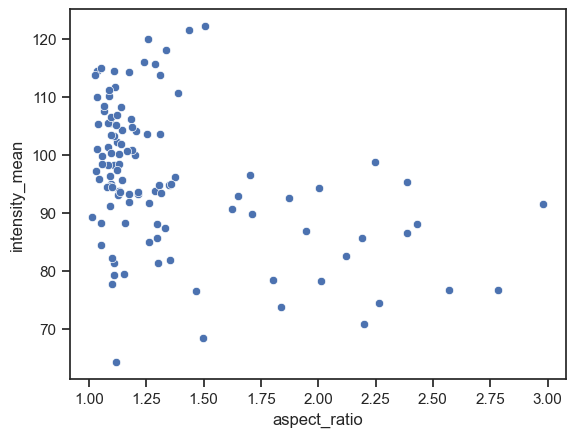
And make a scatter plot of aspect_ratio vs intensity mean.
sns.scatterplot(data=df, x="aspect_ratio", y="intensity_mean")
<AxesSubplot: xlabel='aspect_ratio', ylabel='intensity_mean'>
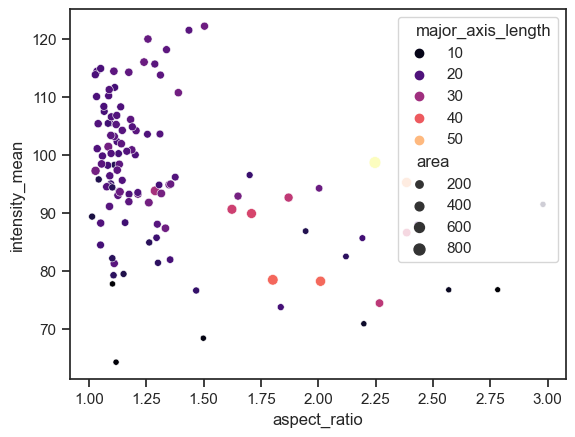
We can already embbed and visualize other features by providing a few extra arguments.
sns.scatterplot(data=df, x="aspect_ratio", y="intensity_mean", size="area", hue="major_axis_length", palette='magma')
<AxesSubplot: xlabel='aspect_ratio', ylabel='intensity_mean'>
Scatter plots with subplots#
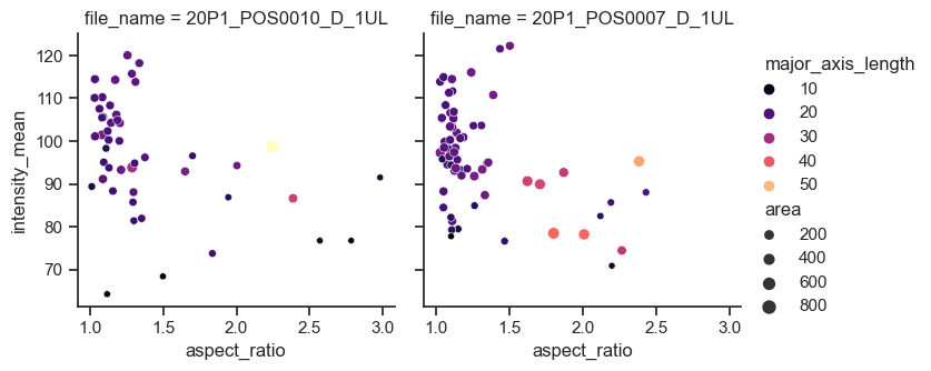
The scatterplot function is an axes-level function. This means, if we want to add subplots, we also need to create figure and axes from matplotlib first and pass the axes handles. That’s when knowing some matplotlib syntax may be handy!
However, seaborn also has figure-level functions, where the subplots are also just an argument.
In the example below, we use the relplot function (from relationship) and separate the files by providing ‘file_name’ to the argument col,
sns.relplot(data=df, x="aspect_ratio", y="intensity_mean", size="area", hue="major_axis_length", col="file_name", palette='magma', height=3.5, aspect=1)
<seaborn.axisgrid.FacetGrid at 0x15d7d7550>
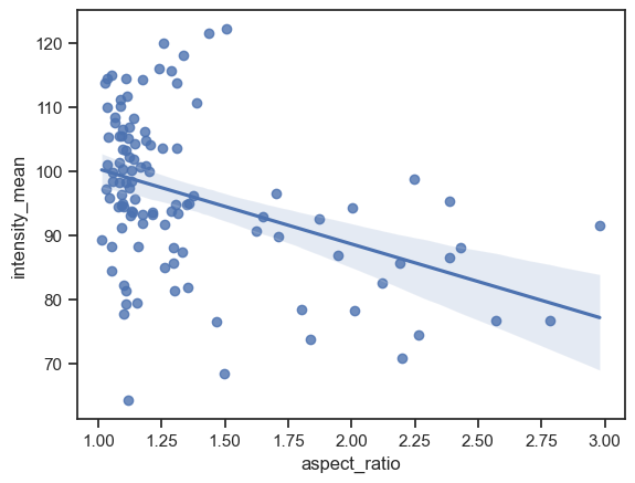
Adding a line regression model#
There are two functions to make a scatter plot with a line regression model: regplot and lmplot. As before, regplot is an axes-level funtion while lmplot is a figure-level function.
Let’s plot an example of each of them
sns.regplot(data=df, x="aspect_ratio", y="intensity_mean")
<AxesSubplot: xlabel='aspect_ratio', ylabel='intensity_mean'>
Line Regression with subplots#
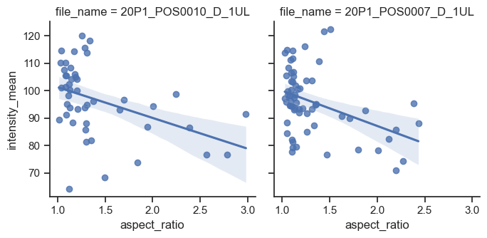
sns.lmplot(data=df, x="aspect_ratio", y="intensity_mean", col="file_name", height=3.5)
<seaborn.axisgrid.FacetGrid at 0x15d7dd5e0>
Plotting Distributions with Seaborn#
Boxplots#
The axes function for plotting boxplots is boxplot.
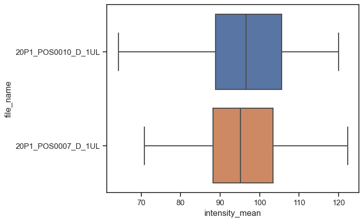
Seaborn already identified file_name as a categorical value and ìntensity_mean as a numerical value. Thus, it plots boxplots for the intensity variable. If we invert x and y, we still get the same graph, but as vertical bosplots.
boxplot = sns.boxplot(data=df, x="intensity_mean", y="file_name")
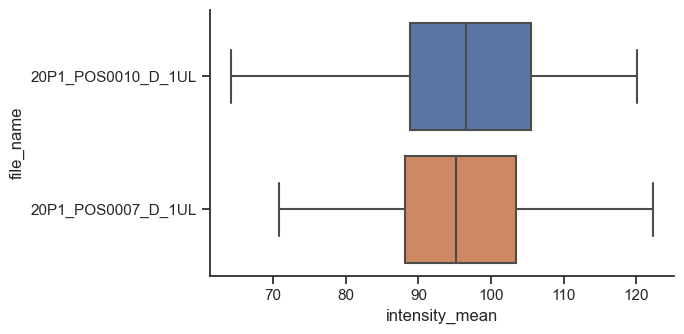
The figure-level, and more general, version of this kind of plot is catplot. We just have to provide kind as box.
sns.catplot(data=df,
            x="intensity_mean",
            y="file_name",
            kind="box",
            height=3.5,
            aspect=2/1)
<seaborn.axisgrid.FacetGrid at 0x15dc3e400>
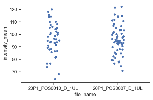
catplot is for many kinds of categorical plots, for example a strip plot.
sns.catplot(data=df, x="file_name", y="intensity_mean", kind="strip", height=3.5, aspect=3/2)
<seaborn.axisgrid.FacetGrid at 0x15dcd46d0>
Histograms and Distribution Plots#
The axes-level function for plotting histograms is histplot.
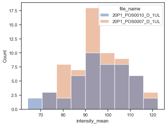
sns.histplot(data=df, x="intensity_mean", hue="file_name")
<AxesSubplot: xlabel='intensity_mean', ylabel='Count'>
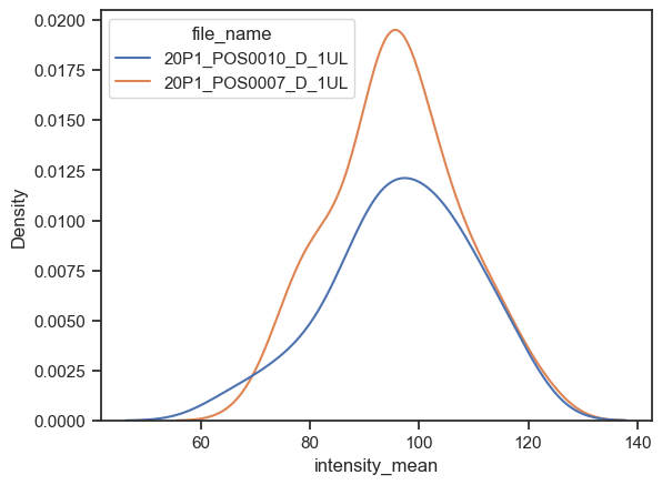
We can instead plot the kernel density estimation (kde) with kdeplot function. Just be careful while interpreting these plots (check some pitfalls here)
sns.kdeplot(data=df, x="intensity_mean", hue="file_name")
<AxesSubplot: xlabel='intensity_mean', ylabel='Density'>
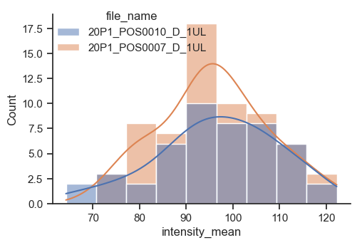
The figure-level function for distributions is distplot. With it, you can have histograms and kde in the same plot, or other kinds of plots, like the empirical cumulative distribution function (ecdf).
plot = sns.displot(data=df, x="intensity_mean", hue="file_name", kde=True, height=3.5, aspect=3/2)
sns.move_legend(plot, 'upper left', bbox_to_anchor=(0.1,1))
Multivariate views#
In this notebook, we show a few examples of how to have plots with graphs of different types in a figure, like having a scatter plot with marginal distributions or even a multivariate plot with pair relationships of all properties in a table.
Because these plots involve managing subplots, they are all figure-level functions.
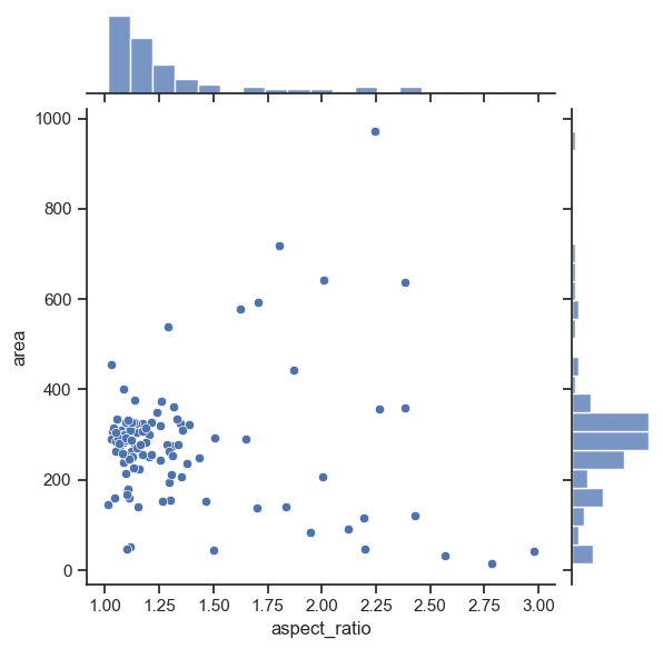
Plotting joint and marginal distributions#
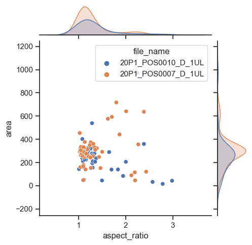
To have a joint distribution of two variableswith the marginal distributions on the sides, we can use jointplot.
sns.jointplot(data=df, x="aspect_ratio", y="area")
<seaborn.axisgrid.JointGrid at 0x15ddd45b0>
As expected, it is possible to separate groups by passing a categorical property to the hue argument. This has an effect on the marginal distribution, turning them from histogram to kde plots.
sns.jointplot(data=df, x="aspect_ratio", y="area", hue='file_name', height=5)
<seaborn.axisgrid.JointGrid at 0x15e8f5b80>
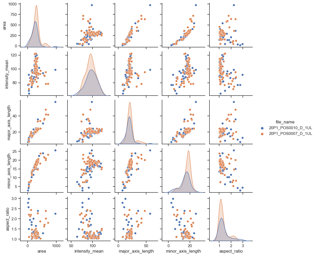
Plotting many distributions at once#
The above examples displayed a plot with relationship between two properties. This can be further expanded with the pairplot function
sns.pairplot(data=df, hue="file_name", height=2)
<seaborn.axisgrid.PairGrid at 0x15eb44af0>
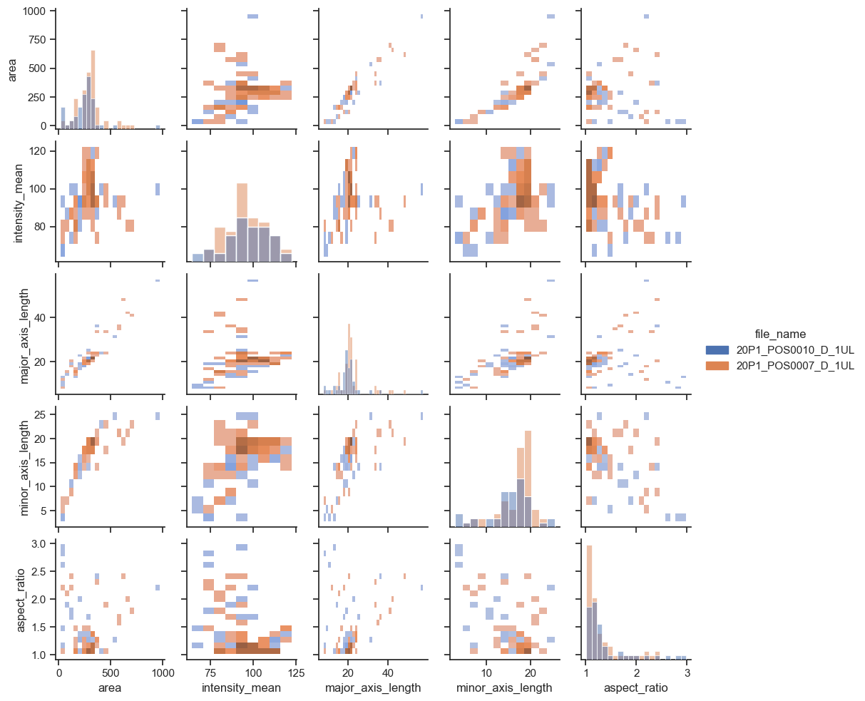
If you have too many points, displaying every single point may yield graphs too poluted. An alternative visualization in this case could be a 2D histogram plot. We can do that by changing the kind argument to “hist”.
sns.pairplot(data=df, hue="file_name", kind = "hist", height=2)
<seaborn.axisgrid.PairGrid at 0x15f5f9d60>
Exercises#
Exercise 1#
Plot a line regression model on a single plot, with points and lines having different colors according to ‘file_name’.
Hint: use a function that accepts a hue argument
Exercise 2#
Plot two empirical cumulative distribution functions for ‘area’ from different files on a same graph with different colors.
Repeat this for the property ‘intensity_mean’ on a second figure. Infer whether you would expect these properties to be different or not.
*Hint: look for the kind parameter of displot
Exercise 3#
You may have noticed that the pairplot is redundant in some plots because the upper diagonal displays the same relationships rotated.
Redraw the pairplot to display only the lower diagonal of the plots.
Hint: explore the properties of the pairplot
Exercise 4#
Use the following images and the corresponding data:
image1 = imread("../../data/BBBC007_batch/20P1_POS0010_D_1UL.tif")
image2 = imread("../../data/BBBC007_batch/20P1_POS0007_D_1UL.tif")
data = df[ (df['file_name'] == '20P1_POS0010_D_1UL') | (df['file_name'] == '20P1_POS0007_D_1UL')]
data
| area | intensity_mean | major_axis_length | minor_axis_length | aspect_ratio | file_name | |
|---|---|---|---|---|---|---|
| 0 | 139 | 96.546763 | 17.504104 | 10.292770 | 1.700621 | 20P1_POS0010_D_1UL |
| 1 | 360 | 86.613889 | 35.746808 | 14.983124 | 2.385805 | 20P1_POS0010_D_1UL |
| 2 | 43 | 91.488372 | 12.967884 | 4.351573 | 2.980045 | 20P1_POS0010_D_1UL |
| 3 | 140 | 73.742857 | 18.940508 | 10.314404 | 1.836316 | 20P1_POS0010_D_1UL |
| 4 | 144 | 89.375000 | 13.639308 | 13.458532 | 1.013432 | 20P1_POS0010_D_1UL |
| ... | ... | ... | ... | ... | ... | ... |
| 106 | 305 | 88.252459 | 20.226532 | 19.244210 | 1.051045 | 20P1_POS0007_D_1UL |
| 107 | 593 | 89.905565 | 36.508370 | 21.365394 | 1.708762 | 20P1_POS0007_D_1UL |
| 108 | 289 | 106.851211 | 20.427809 | 18.221452 | 1.121086 | 20P1_POS0007_D_1UL |
| 109 | 277 | 100.664260 | 20.307965 | 17.432920 | 1.164920 | 20P1_POS0007_D_1UL |
| 110 | 46 | 70.869565 | 11.648895 | 5.298003 | 2.198733 | 20P1_POS0007_D_1UL |
111 rows × 6 columns
Create figure with two rows and two columns of subplots.
Display the two images below in the first row of subplots
Display graphs for the corresponding figures on the second row.