Adding Statistic Annotations#
Sources and inspiration:
https://pandas.pydata.org/docs/user_guide/visualization.html
https://levelup.gitconnected.com/statistics-on-seaborn-plots-with-statannotations-2bfce0394c00
If running this from Google Colab, uncomment the cell below and run it. Otherwise, just skip it.
# !pip install watermark
# !pip install statannotations
import matplotlib.pyplot as plt
import pandas as pd
import seaborn as sns


import numpy as np
from scipy.stats import mannwhitneyu
Seaborn with statistics annotations#
Introduction#
Many libraries are available in Python to clean, analyze, and plot data. Python also has robust statistical packages which are used by thousands of other projects.
That said, if you wish, basically, to add statistics to your plots, with the beautiful brackets as you can see in papers using R or other statistical software, there are not many options.
In this part, we will use statannotations, a package to add statistical significance annotations on seaborn
categorical plots.
Specifically, we will answer the following questions:
How to add custom annotations to a seaborn plot?
How to automatically format previously computed p-values in several different ways, then add these to a plot in a single function call?
How to both perform the statistical tests and add their results to a plot, optionally applying a multiple comparisons correction method?
DISCLAIMER: This tutorial aims to describe how to use a plot annotation library, not to teach statistics. The examples are meant only to illustrate the plots, not the statistical methodology, and we will not draw any conclusions about the dataset explored.
A correct approach would have required the careful definition of a research question based, evaluation how the data acquisitions and maybe, ultimately, different group comparisons and/or tests. Of course, the p-value is not the right answer for everything either. But the aim is to learn how to aproach this so you can later easily reuse the notebooks, charts and even share it with your research!
Preparing the tools#
First, let’s prepare the data we will use as example.
We make 3 subsets from the penguins data cleaned, split by ‘species’. We also split one of the species by ‘sex’.
# Load and clean penguins data
penguins = sns.load_dataset("penguins")
penguins_cleaned = penguins.dropna()

# Split penguins data by species
Adelie_values =  penguins_cleaned[penguins_cleaned['species']=='Adelie']
Chinstrap_values = penguins_cleaned[penguins_cleaned['species']=='Chinstrap']
Gentoo_values = penguins_cleaned[penguins_cleaned['species']=='Gentoo']

# Split 'Gentoo' species by sex
Gentoo_values_male=Gentoo_values[Gentoo_values.sex=='Male']
Gentoo_values_female=Gentoo_values[Gentoo_values.sex=='Female']
Using statannotations#
The general pattern is
Decide which pairs of data you would like to annotate
Instantiate an
Annotator(or reuse it on a new plot, we’ll cover that later)Configure it (text formatting, statistical test, multiple comparisons correction method…)
Make the annotations (we’ll cover these cases)
By providing completely custom annotations (A)
By providing pvalues to be formatted before being added to the plot (B)
By applying a configured test (C)
Annotate !
from statannotations.Annotator import Annotator
If we already have a seaborn plot (and its associated axes), and statistical results, or any other text we would like to
display on the plot, these are the detailed steps required.
STEP 0: What to compare
A pre-requisite to annotating the plot, is deciding which pairs you are comparing.
You’ll pass which boxes (or bars, violins, etc) you want to annotate in a pairs parameter. In this case, it is the
equivalent of 'Adelie vs Chinstrap' and others.
For statannotations, we specify this as a list of tuples like ('Adelie', 'Chinstrap')
pairs = [('Adelie', 'Chinstrap'),
         ('Adelie', 'Gentoo'),
         ('Chinstrap', 'Gentoo'),
         ]
STEP 1: The annotator
We now have all we need to instantiate the annotator
annotator = Annotator(ax, pairs, ...) # With ... = all parameters passed to seaborn's plotter
STEP 2: In this first example, we will not configure anything.
STEP 3: We’ll then add the raw pvalues from scipy’s returned values
pvalues = [mannwhitneyu(Adelie_values['bill_length_mm'], Chinstrap_values['bill_length_mm']).pvalue,
           mannwhitneyu(Adelie_values['bill_length_mm'], Gentoo_values['bill_length_mm']).pvalue,
           mannwhitneyu(Chinstrap_values['bill_length_mm'], Gentoo_values['bill_length_mm']).pvalue]
using
annotator.set_custom_annotations(pvalues)
STEP 4: Annotate !
annotator.annotate()
(*) Make sure pairs and annotations (pvalues here) are in the same order
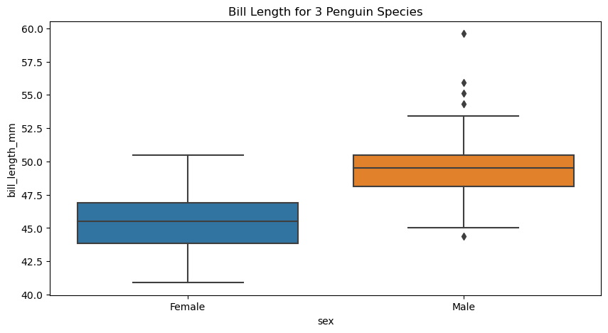
figure, axes = plt.subplots(figsize=(10, 5))

sns.boxplot(
    data = Gentoo_values,
    x = "sex",
    y = "bill_length_mm",
    ax = axes)

axes.set(title="Bill Length for 3 Penguin Species")
[Text(0.5, 1.0, 'Bill Length for 3 Penguin Species')]
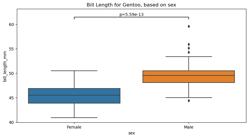
pairs = [('Female', 'Male'),
        #  ('data 1', 'data 2'),
         ]

# pvalues with scipy, format based on pairs:
stat_results_GMF = [mannwhitneyu(Gentoo_values_female['bill_length_mm'], Gentoo_values_male['bill_length_mm'], alternative="two-sided"),]
pvalues = [result.pvalue for result in stat_results_GMF]

formatted_pvalues = [f"p={p:.2e}" for p in pvalues]

# Create new plot
figure, axes = plt.subplots(figsize=(10, 5))

plotting_parameters = {
    'data':Gentoo_values,
    'x':'sex',
    'y':'bill_length_mm',
}

# Plot with seaborn
sns.boxplot(ax=axes, **plotting_parameters)

# Add annotations
annotator = Annotator(ax=axes, pairs=pairs, **plotting_parameters)
annotator.set_custom_annotations(formatted_pvalues)
annotator.annotate()

axes.set(title="Bill Length for Gentoo, based on sex")
p-value annotation legend:
      ns: p <= 1.00e+00
       *: 1.00e-02 < p <= 5.00e-02
      **: 1.00e-03 < p <= 1.00e-02
     ***: 1.00e-04 < p <= 1.00e-03
    ****: p <= 1.00e-04

Female vs. Male: p=5.59e-13
[Text(0.5, 1.0, 'Bill Length for Gentoo, based on sex')]
Use statannotations to apply scipy test#
Finally, statannotations can take care of most of the steps required to run the test by calling scipy.stats directly
and annotate the plot.
The available options are
Mann-Whitney
t-test (independent and paired)
Welch’s t-test
Levene test
Wilcoxon test
Kruskal-Wallis test
We will cover how to use a test that is not one of those already interfaced in statannotations.
If you are curious, you can also take a look at the usage
notebook in the project repository.
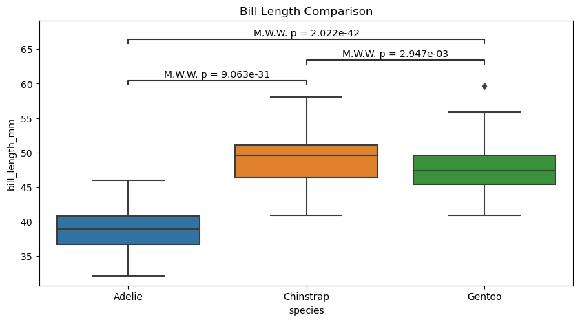
Simple#
# Create new plot
figure, axes = plt.subplots(figsize=(10, 5))

plotting_parameters = {
    'data': penguins_cleaned,
    'x':'species',
    'y':'bill_length_mm',
}

pairs = [('Adelie', 'Chinstrap'),
         ('Adelie', 'Gentoo'),
         ('Chinstrap', 'Gentoo'),
         ]


# Plot with seaborn
sns.boxplot(ax=axes, **plotting_parameters)

# Add annotations
annotator.new_plot(ax=axes, pairs=pairs, **plotting_parameters)
annotator.configure(test='Mann-Whitney', text_format="simple", verbose=True).apply_and_annotate()

axes.set(title="Bill Length Comparison")
Adelie vs. Chinstrap: Mann-Whitney-Wilcoxon test two-sided, P_val:9.063e-31 U_stat=1.000e+02
Chinstrap vs. Gentoo: Mann-Whitney-Wilcoxon test two-sided, P_val:2.947e-03 U_stat=5.105e+03
Adelie vs. Gentoo: Mann-Whitney-Wilcoxon test two-sided, P_val:2.022e-42 U_stat=2.160e+02
[Text(0.5, 1.0, 'Bill Length Comparison')]

Full#
# Create new plot
figure, axes = plt.subplots(figsize=(10, 5))

plotting_parameters = {
    'data': penguins_cleaned,
    'x':'species',
    'y':'bill_length_mm',
}

pairs = [('Adelie', 'Chinstrap'),
         ('Adelie', 'Gentoo'),
         ('Chinstrap', 'Gentoo'),
         ]


# Plot with seaborn
sns.boxplot(ax=axes, **plotting_parameters)

# Add annotations
annotator.new_plot(axes, pairs=pairs, **plotting_parameters)
annotator.configure(test='Mann-Whitney', text_format="full", verbose=True).apply_and_annotate()

axes.set(title="Bill Length Comparison")
Adelie vs. Chinstrap: Mann-Whitney-Wilcoxon test two-sided, P_val:9.063e-31 U_stat=1.000e+02
Chinstrap vs. Gentoo: Mann-Whitney-Wilcoxon test two-sided, P_val:2.947e-03 U_stat=5.105e+03
Adelie vs. Gentoo: Mann-Whitney-Wilcoxon test two-sided, P_val:2.022e-42 U_stat=2.160e+02
[Text(0.5, 1.0, 'Bill Length Comparison')]
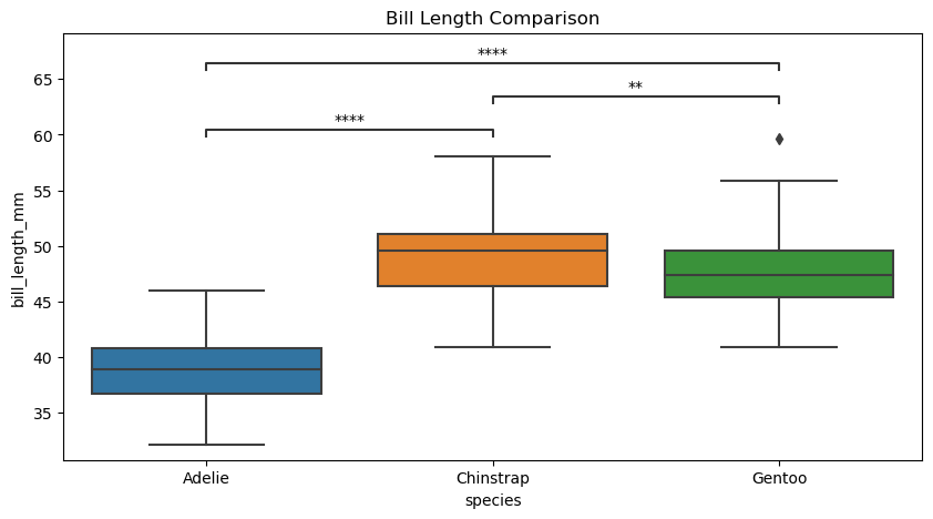
Star#
# Create new plot
figure, axes = plt.subplots(figsize=(10, 5))

plotting_parameters = {
    'data': penguins_cleaned,
    'x':'species',
    'y':'bill_length_mm',
}

pairs = [('Adelie', 'Chinstrap'),
         ('Adelie', 'Gentoo'),
         ('Chinstrap', 'Gentoo'),
         ]


# Plot with seaborn
sns.boxplot(ax=axes, **plotting_parameters)

# Add annotations
annotator.new_plot(ax=axes, pairs=pairs, **plotting_parameters)
annotator.configure(test='Mann-Whitney', text_format="star", verbose=True).apply_and_annotate()

axes.set(title="Bill Length Comparison")
p-value annotation legend:
      ns: p <= 1.00e+00
       *: 1.00e-02 < p <= 5.00e-02
      **: 1.00e-03 < p <= 1.00e-02
     ***: 1.00e-04 < p <= 1.00e-03
    ****: p <= 1.00e-04

Adelie vs. Chinstrap: Mann-Whitney-Wilcoxon test two-sided, P_val:9.063e-31 U_stat=1.000e+02
Chinstrap vs. Gentoo: Mann-Whitney-Wilcoxon test two-sided, P_val:2.947e-03 U_stat=5.105e+03
Adelie vs. Gentoo: Mann-Whitney-Wilcoxon test two-sided, P_val:2.022e-42 U_stat=2.160e+02
[Text(0.5, 1.0, 'Bill Length Comparison')]
# Create new plot
figure, axes = plt.subplots(figsize=(10, 5))

plotting_parameters = {
    'data':penguins_cleaned,
    'x':'species',
    'y':'bill_length_mm',
}

pairs = [('Adelie', 'Chinstrap'),
         ('Adelie', 'Gentoo'),
         ('Chinstrap', 'Gentoo'),
         ]


# Plot with seaborn
sns.violinplot(ax=axes, **plotting_parameters)

# Add annotations
annotator.new_plot(ax=axes, pairs=pairs, **plotting_parameters)
annotator.configure(test='Mann-Whitney', text_format="star", verbose=True).apply_and_annotate()

axes.set(title="Bill Length Comparison of Penguin Species")
p-value annotation legend:
      ns: p <= 1.00e+00
       *: 1.00e-02 < p <= 5.00e-02
      **: 1.00e-03 < p <= 1.00e-02
     ***: 1.00e-04 < p <= 1.00e-03
    ****: p <= 1.00e-04

Adelie vs. Chinstrap: Mann-Whitney-Wilcoxon test two-sided, P_val:9.063e-31 U_stat=1.000e+02
Chinstrap vs. Gentoo: Mann-Whitney-Wilcoxon test two-sided, P_val:2.947e-03 U_stat=5.105e+03
Adelie vs. Gentoo: Mann-Whitney-Wilcoxon test two-sided, P_val:2.022e-42 U_stat=2.160e+02
[Text(0.5, 1.0, 'Bill Length Comparison of Penguin Species')]
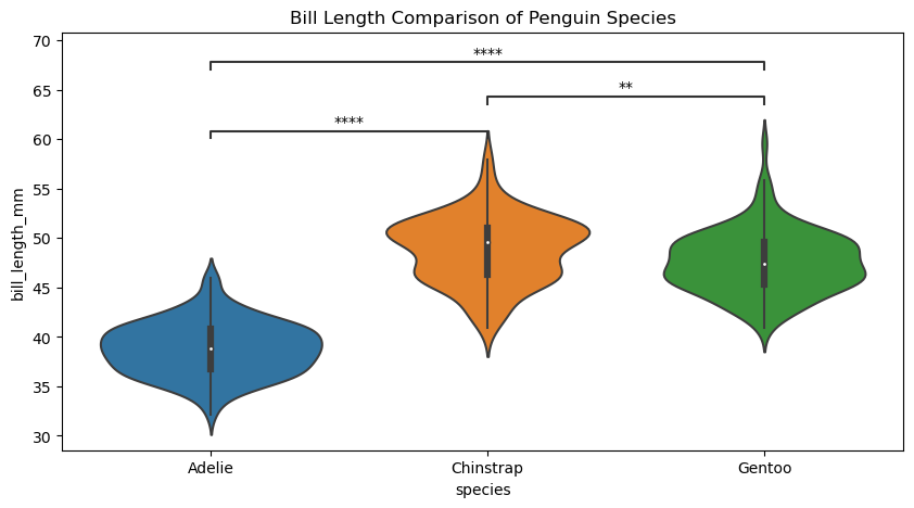
figure.savefig('violin_annotated_PNG.png', dpi=300)
from watermark import watermark
watermark(iversions=True, globals_=globals())
print(watermark())
print(watermark(packages="watermark,numpy,pandas,seaborn,matplotlib,scipy,statannotations"))
Last updated: 2023-08-25T19:06:19.247868+02:00

Python implementation: CPython
Python version       : 3.9.17
IPython version      : 8.14.0

Compiler    : MSC v.1929 64 bit (AMD64)
OS          : Windows
Release     : 10
Machine     : AMD64
Processor   : Intel64 Family 6 Model 165 Stepping 2, GenuineIntel
CPU cores   : 16
Architecture: 64bit

watermark      : 2.4.3
numpy          : 1.23.5
pandas         : 2.0.3
seaborn        : 0.12.2
matplotlib     : 3.7.2
scipy          : 1.11.2
statannotations: 0.4.4