Using Seaborn to Plot Distributions#
Sources and inspiration:
https://pandas.pydata.org/docs/user_guide/visualization.html
https://levelup.gitconnected.com/statistics-on-seaborn-plots-with-statannotations-2bfce0394c00
If running this from Google Colab, uncomment the cell below and run it. Otherwise, just skip it.
# !pip install watermark
import pandas as pd
import seaborn as sns
import matplotlib.pyplot as plt
Brief Data Exploration with pandas#
We can work with one of the seaborn training datasets Penguins
penguins = sns.load_dataset("penguins")
pandas package can help us get some overview of the data.
penguins.describe()
| bill_length_mm | bill_depth_mm | flipper_length_mm | body_mass_g | |
|---|---|---|---|---|
| count | 342.000000 | 342.000000 | 342.000000 | 342.000000 |
| mean | 43.921930 | 17.151170 | 200.915205 | 4201.754386 |
| std | 5.459584 | 1.974793 | 14.061714 | 801.954536 |
| min | 32.100000 | 13.100000 | 172.000000 | 2700.000000 |
| 25% | 39.225000 | 15.600000 | 190.000000 | 3550.000000 |
| 50% | 44.450000 | 17.300000 | 197.000000 | 4050.000000 |
| 75% | 48.500000 | 18.700000 | 213.000000 | 4750.000000 |
| max | 59.600000 | 21.500000 | 231.000000 | 6300.000000 |
Since describe() function works only with numers, we will need to look at the few first values, and search for unique strings in some of the columns.
penguins.head()
| species | island | bill_length_mm | bill_depth_mm | flipper_length_mm | body_mass_g | sex | |
|---|---|---|---|---|---|---|---|
| 0 | Adelie | Torgersen | 39.1 | 18.7 | 181.0 | 3750.0 | Male |
| 1 | Adelie | Torgersen | 39.5 | 17.4 | 186.0 | 3800.0 | Female |
| 2 | Adelie | Torgersen | 40.3 | 18.0 | 195.0 | 3250.0 | Female |
| 3 | Adelie | Torgersen | NaN | NaN | NaN | NaN | NaN |
| 4 | Adelie | Torgersen | 36.7 | 19.3 | 193.0 | 3450.0 | Female |
penguins["species"].unique()
array(['Adelie', 'Chinstrap', 'Gentoo'], dtype=object)
penguins["island"].unique()
array(['Torgersen', 'Biscoe', 'Dream'], dtype=object)
penguins["sex"].unique()
array(['Male', 'Female', nan], dtype=object)
Let’s take a look at missing data (NaNs) with the isnull() method.
penguins.isnull().sum()
species               0
island                0
bill_length_mm        2
bill_depth_mm         2
flipper_length_mm     2
body_mass_g           2
sex                  11
dtype: int64
We will want to drop all rows with unknown entries with dropna() function.
penguins_cleaned = penguins.dropna()
penguins_cleaned.isnull().sum()
species              0
island               0
bill_length_mm       0
bill_depth_mm        0
flipper_length_mm    0
body_mass_g          0
sex                  0
dtype: int64
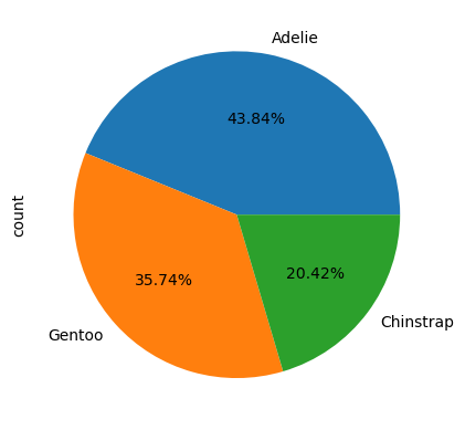
Of course we can do a fast visualisation with pandas, but it is more useful for exploring the data than sharing the resulting charts.
Species=penguins_cleaned["species"].value_counts()
Species.plot(kind='pie',autopct="%.2f%%")
<Axes: ylabel='count'>
One of my favourite things about seaborn is that part of the documentations is a Example Gallery where you can simply copy-paste the code for charts. But there is a catch! What is missing?
Preparing charts for any occasion#
Setting the Theme and Color Pallet#
We can use the set_theme() function which changes the global defaults for all plots using the matplotlib system. So we can presetup the style or color palettes for the rest of the notebook.
You can explore more in Controlling figure aesthetics or Choosing color palettes.
We can control figure size and some axes parameters by using plt.subplots from matplotlib to ave access to the figure and the axes objects.
# Apply the theme
sns.set_theme(style="ticks", palette="colorblind")
# sns.set_theme(style="white")
# sns.set_theme(style="dark")

# Set up the matplotlib figure
figure, axes = plt.subplots(figsize=(5, 5))
Axes-level plots#
Seaborn has 2 hierarchy level of plots: figure-level and axes-level.
A figure-level function, like relplot, generates the full figure and sets the axes inside it depending on the provided parameters. An axes-level function generates a plot that should be put into an axes object. This allows having different types of plots in the same figure, because we can put each plot in a different axis.

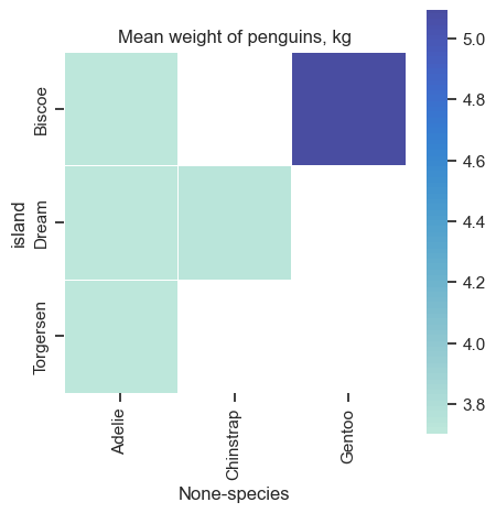
Pivot tables and Heat maps#
As shown before, we can generate heatmaps from a pivotted table and from a correlation matrix.
# penguins_cleaned.groupby(['species', 'island'])['body_mass_g'].aggregate('mean').unstack()
pivot_table = penguins_cleaned.pivot_table("body_mass_g", index=["island", "species"]).unstack()

pivot_table.head()
| body_mass_g | |||
|---|---|---|---|
| species | Adelie | Chinstrap | Gentoo |
| island | |||
| Biscoe | 3709.659091 | NaN | 5092.436975 |
| Dream | 3701.363636 | 3733.088235 | NaN |
| Torgersen | 3708.510638 | NaN | NaN |
Below we create an empty canvas with instances of a figure object (fig) and an axes object (ax).
We make a heatmap with the heatmap function and assign it to the ax variable.
# Set up the matplotlib figure
figure, axes = plt.subplots(figsize=(5, 10))

# Draw the heatmap
sns.heatmap(
    data=pivot_table/1000,
    center=6,
    square=True,
    linewidths=.5, cbar_kws={"shrink": .5},
    ax = axes,
    #annot=True,
    #cmap="coolwarm", #Spectral)
)

axes.set(title="Mean weight of penguins, kg")
axes.set_xticklabels(penguins_cleaned.species.unique())
[Text(0.5, 0, 'Adelie'), Text(1.5, 0, 'Chinstrap'), Text(2.5, 0, 'Gentoo')]
Some figure/chart size are fixed, and if you force the figsize to be different - the chart size and shape will stay, but it will create empty part of image. Look at the output of this figure.
figure.savefig('heatmap_uneven_PNG.png', dpi=300)
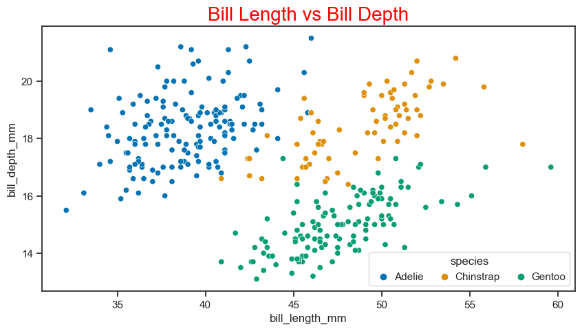
Scatter plot#
The scatter plot is used to display the relationship between variables. Let’s see the scatter plot of culmen lengths and depths by penguin species.
# Set up the matplotlib figure
figure, axes = plt.subplots(figsize=(10, 5))

# Make a scatterplot
sns.scatterplot(
    data=penguins_cleaned,
    x="bill_length_mm",
    y="bill_depth_mm",
    hue="species",
    ax = axes
    )
# Give the plot a title
plt.title("Bill Length vs Bill Depth", size=20, color="red") #matplotlib way to define title

# Improve the legend
sns.move_legend(
    obj=axes,
    loc="lower right",
    ncol=3,
    frameon=True,
    columnspacing=1,
    handletextpad=0
)
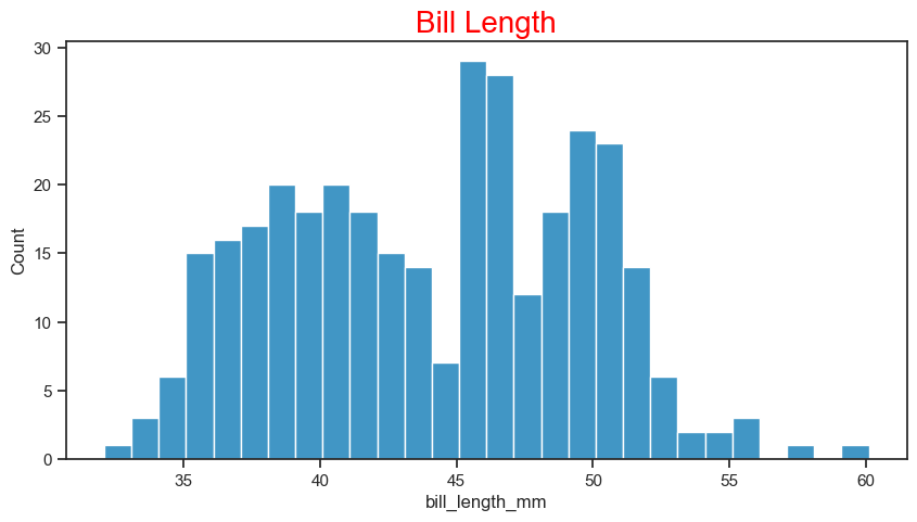
Histogram#
The histogram plot shows the distribution of the data. You can use the histogram plot to see the distribution of one or more variables. Now let’s see the histogram of the bill length using the histplot function.
# Set up the matplotlib figure
figure, axes = plt.subplots(figsize=(10, 5))

sns.histplot(
    data = penguins_cleaned,
    x = "bill_length_mm",
    binwidth=1,
    ax = axes
    )
plt.title("Bill Length", size=20, color="red")
Text(0.5, 1.0, 'Bill Length')
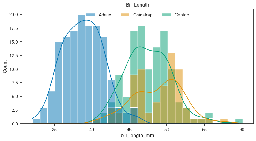
We can display subsets histograms with different colors easily with the same function. We just have to give some additional parameters, like assigning the column ‘species’ of the dataframe to the hue parameter.
# Set up the matplotlib figure
figure, axes = plt.subplots(figsize=(10, 5))

sns.histplot(
    data = penguins_cleaned,
    x = "bill_length_mm",
    binwidth = 1,
    hue = "species",
    kde = True,
    ax = axes
    )
axes.set(title="Bill Length")

sns.move_legend(
    axes, "upper center",
    bbox_to_anchor=(.5, 1),
    ncol=3,
    title=None,
    frameon=False,
)
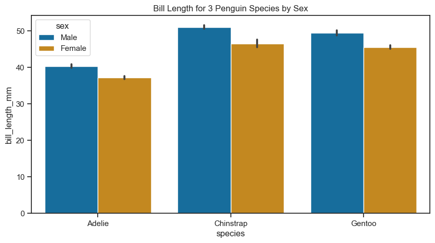
Bar plot#
A bar plot represents an estimate of the central tendency for a numeric variable with the height of each rectangle. Let’s see the bar plot showing the bill lengths of penguin species.
# Set up the matplotlib figure
figure, axes = plt.subplots(figsize=(10, 5))

sns.barplot(
    data = penguins_cleaned,
    x = "species",
    y = "bill_length_mm",
    hue = "sex",
    ax = axes
    )
axes.set(title="Bill Length for 3 Penguin Species by Sex")
[Text(0.5, 1.0, 'Bill Length for 3 Penguin Species by Sex')]
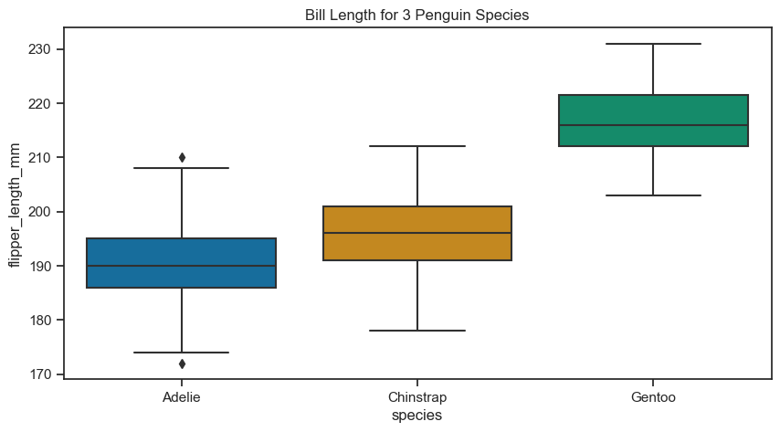
Box plot#
The box plot is used to compare the distribution of numerical data between levels of a categorical variable. Let’s see the distribution of flipper length by species.
figure, axes = plt.subplots(figsize=(10, 5))

sns.boxplot(
    data =penguins_cleaned,
    x = "species",
    y = "flipper_length_mm",
    ax = axes
    )
axes.set(title="Bill Length for 3 Penguin Species")
[Text(0.5, 1.0, 'Bill Length for 3 Penguin Species')]
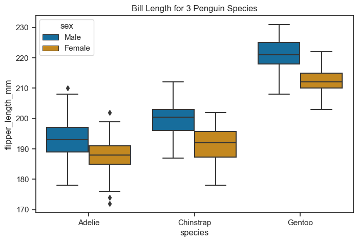
You can use the hue parameter to see a boxplot of flipper lengths of species by sex.
figure, axes = plt.subplots(figsize=(8, 5))

sns.boxplot(
    data = penguins_cleaned,
    x = "species",
    y = "flipper_length_mm",
    hue="sex",
    ax = axes)
axes.set(title="Bill Length for 3 Penguin Species")
[Text(0.5, 1.0, 'Bill Length for 3 Penguin Species')]
But - does the box plot represent the distribution in a best way? Source

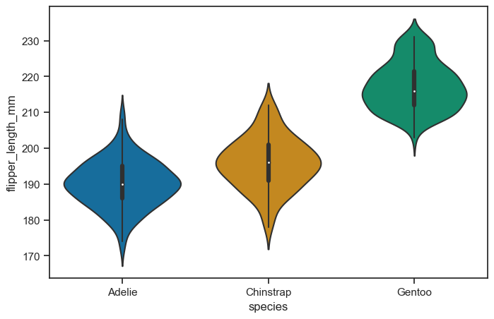
Violin plot#

Violin graphs are similar to box plots but provide additional benefits.
Box plots are widely used to show medians, ranges, and variabilities in different groups.
However, box plots can be misleading when the data’s distribution changes while maintaining the same summary statistics.
Violin plots carry all the information of a box plot but are not affected by changes in data distribution.
Violin graphs combine the advantages of density plots with improved readability.
The shape of a violin plot comes from the data’s density plot, which is turned sideways and mirrored on both sides of the box plot.
The thicker part of the violin represents higher frequency values, while the thinner part represents lower frequency values.
Violin plots are preferred over density plots when there are many groups, as overlapping density plots can become difficult to interpret.
Violin graphs are visually intuitive and attractive.
Different sets are compared by placing their violin plots side by side, avoiding confusion about colors or patterns.
Violin plots are easy to read, with the median represented by a dot, the interquartile range by a box, and the 95% confidence interval by whiskers.
The shape of the violin displays the frequencies of values, making it visually informative and appealing.
Violin graphs are non-parametric and suitable for various data types.
Unlike bar graphs with means and error bars, violin plots include all data points.
They are useful for visualizing samples with small sizes and work well for both quantitative and qualitative data.
Violin plots do not require data to conform to a normal distribution, making them a versatile visualization tool.
figure, axes = plt.subplots(figsize=(8, 5))

sns.violinplot(
    data = penguins_cleaned,
    x = "species",
    y = "flipper_length_mm",
    ax = axes
    )
<Axes: xlabel='species', ylabel='flipper_length_mm'>
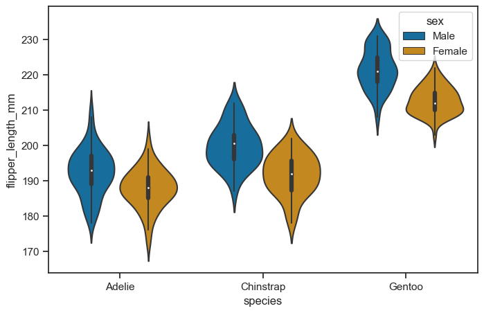
figure, axes = plt.subplots(figsize=(8, 5))

sns.violinplot(
    data = penguins_cleaned,
    x = "species",
    y = "flipper_length_mm",
    hue = "sex",
    ax = axes
    )
<Axes: xlabel='species', ylabel='flipper_length_mm'>
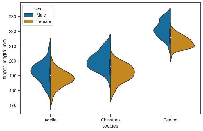
It’s also possible to “split” the violins when the hue parameter has only two levels, which can allow for a more efficient use of space:
figure, axes = plt.subplots(figsize=(8, 5))

sns.violinplot(
    data = penguins_cleaned,
    x = "species",
    y = "flipper_length_mm",
    hue = "sex",
    ax = axes,
    split = True,
    )
<Axes: xlabel='species', ylabel='flipper_length_mm'>
It can also be useful to combine swarmplot() or stripplot() with a box plot or violin plot to show each observation along with a summary of the distribution:
figure, axes = plt.subplots(figsize=(8, 5))

sns.violinplot(
    data = penguins_cleaned,
    x = "species",
    y = "flipper_length_mm",
    ax = axes,
    )

sns.swarmplot(
    data=penguins_cleaned,
    x="species",
    y="flipper_length_mm",
    color="k",
    size=3,
    ax=axes)
<Axes: xlabel='species', ylabel='flipper_length_mm'>
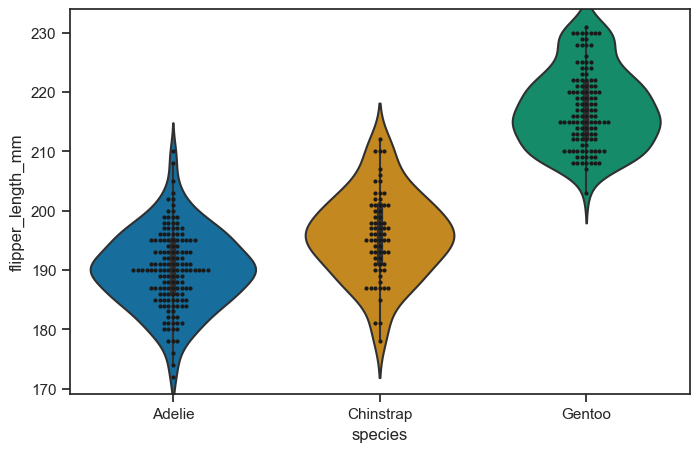
figure.savefig("swarm_test.png")
Learn more about plotting categorical data here.
Other figure-level plots#
Joint Plot#
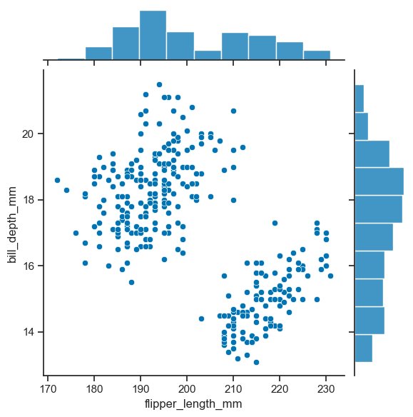
To have a joint distribution of two variables with the marginal distributions on the sides, we can use jointplot.
sns.jointplot(
    data=penguins_cleaned,
    x="flipper_length_mm",
    y="bill_depth_mm"
    )
<seaborn.axisgrid.JointGrid at 0x1f4493a6130>
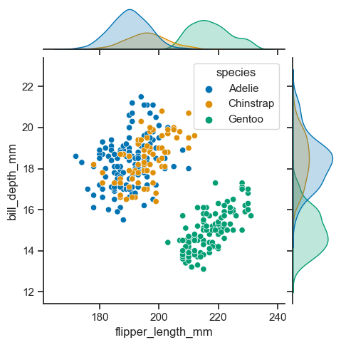
As expected, it is possible to separate groups by passing a categorical property to the hue argument. This has an effect on the marginal distribution, turning them from histogram to kde plots.
sns.jointplot(
    data=penguins_cleaned,
    x="flipper_length_mm",
    y="bill_depth_mm",
    hue='species',
    height=5)
<seaborn.axisgrid.JointGrid at 0x1f44ac65fa0>
Pair plot#
You can use the pairplot method to see the pair relations of the variables. It is perfect for exploring your dataset in fast way. This function creates cross-plots of each numeric variable in the dataset. Let’s see the pairs of numerical variables according to penguin species in the dataset.
figure = sns.pairplot(
    data=penguins_cleaned,
    hue = "species",
    height=3
    )
c:\Users\mazo260d\mambaforge\envs\devbio-napari-clone\lib\site-packages\seaborn\axisgrid.py:118: UserWarning: The figure layout has changed to tight
  self._figure.tight_layout(*args, **kwargs)
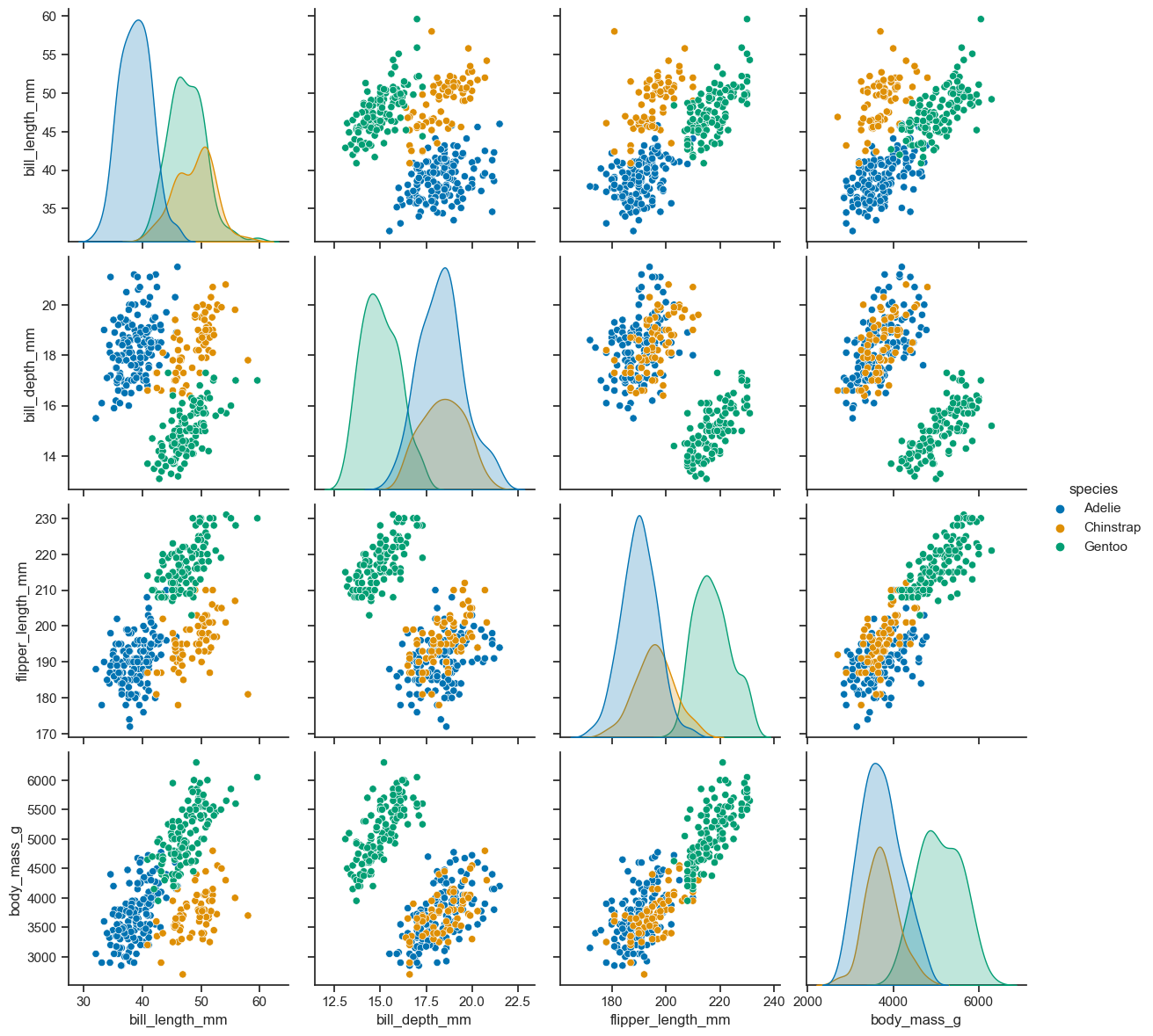
figure.savefig('pairplot_empty_PNG.png', dpi=300)
If you get empty image, you need to clean previous plots with matplotlib.pyplot.close()
import matplotlib
matplotlib.pyplot.close()
And it should work.
figure = sns.pairplot(
    data = penguins_cleaned,
    hue = "species",
    height=3
    )
c:\Users\mazo260d\mambaforge\envs\devbio-napari-clone\lib\site-packages\seaborn\axisgrid.py:118: UserWarning: The figure layout has changed to tight
  self._figure.tight_layout(*args, **kwargs)
figure.savefig('pairplot_working_PNG.png', dpi=300)
Exercise#
Use the following images and the corresponding data
from skimage.io import imread
image1 = imread("../../data/BBBC007_batch/20P1_POS0010_D_1UL.tif")
image2 = imread("../../data/BBBC007_batch/20P1_POS0007_D_1UL.tif")
df = pd.read_csv("../../data/BBBC007_analysis.csv")
data = df[ (df['file_name'] == '20P1_POS0010_D_1UL') | (df['file_name'] == '20P1_POS0007_D_1UL')]
data.head()
| area | intensity_mean | major_axis_length | minor_axis_length | aspect_ratio | file_name | |
|---|---|---|---|---|---|---|
| 0 | 139 | 96.546763 | 17.504104 | 10.292770 | 1.700621 | 20P1_POS0010_D_1UL |
| 1 | 360 | 86.613889 | 35.746808 | 14.983124 | 2.385805 | 20P1_POS0010_D_1UL |
| 2 | 43 | 91.488372 | 12.967884 | 4.351573 | 2.980045 | 20P1_POS0010_D_1UL |
| 3 | 140 | 73.742857 | 18.940508 | 10.314404 | 1.836316 | 20P1_POS0010_D_1UL |
| 4 | 144 | 89.375000 | 13.639308 | 13.458532 | 1.013432 | 20P1_POS0010_D_1UL |
Create figure with two rows and two columns of subplots.
Display the two images below in the first row of subplots
Display graphs for the corresponding figures on the second row. Choose any axes-level function you like.
from watermark import watermark
watermark(iversions=True, globals_=globals())
print(watermark())
print(watermark(packages="watermark,numpy,pandas,seaborn,matplotlib,scipy"))
Last updated: 2023-08-25T16:39:55.148366+02:00

Python implementation: CPython
Python version       : 3.9.17
IPython version      : 8.14.0

Compiler    : MSC v.1929 64 bit (AMD64)
OS          : Windows
Release     : 10
Machine     : AMD64
Processor   : Intel64 Family 6 Model 165 Stepping 2, GenuineIntel
CPU cores   : 16
Architecture: 64bit

watermark : 2.4.3
numpy     : 1.23.5
pandas    : 2.0.3
seaborn   : 0.12.2
matplotlib: 3.7.2
scipy     : 1.11.2