Plotting Distributions with Seaborn
Contents
Plotting Distributions with Seaborn#
With Seaborn, it is also very practical to plot data distributions. We start with simple boxplots and bar graphs. Then, we show how to plot histograms and kde.
import pandas as pd
import numpy as np
import matplotlib.pyplot as plt
import seaborn as sns
sns.set_theme()
Let’s load the same dataframe.
df = pd.read_csv("../../data/BBBC007_analysis.csv")
df.head()
| area | intensity_mean | major_axis_length | minor_axis_length | aspect_ratio | file_name | |
|---|---|---|---|---|---|---|
| 0 | 139 | 96.546763 | 17.504104 | 10.292770 | 1.700621 | 20P1_POS0010_D_1UL |
| 1 | 360 | 86.613889 | 35.746808 | 14.983124 | 2.385805 | 20P1_POS0010_D_1UL |
| 2 | 43 | 91.488372 | 12.967884 | 4.351573 | 2.980045 | 20P1_POS0010_D_1UL |
| 3 | 140 | 73.742857 | 18.940508 | 10.314404 | 1.836316 | 20P1_POS0010_D_1UL |
| 4 | 144 | 89.375000 | 13.639308 | 13.458532 | 1.013432 | 20P1_POS0010_D_1UL |
Boxplots#
The axes function for plotting boxplots is boxplot.
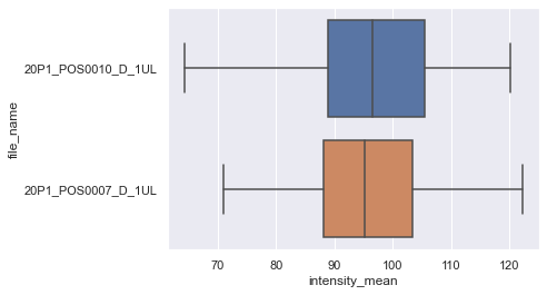
Seaborn already identified file_name as a categorical value and ìntensity_mean as a numerical value. Thus, it plots boxplots for the intensity variable. If we invert x and y, we still get the same graph, but as vertical bosplots.
sns.boxplot(data=df, x="intensity_mean", y="file_name")
<AxesSubplot:xlabel='intensity_mean', ylabel='file_name'>
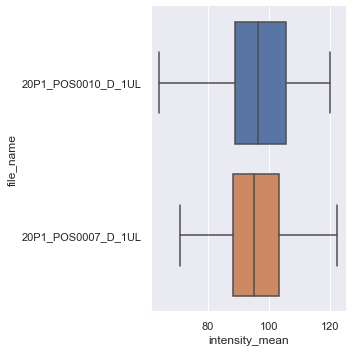
The figure-level, and more general, version of this kind of plot is catplot. We just have to provide kind as box.
sns.catplot(data=df, x="intensity_mean", y="file_name", kind="box")
<seaborn.axisgrid.FacetGrid at 0x27440770b80>
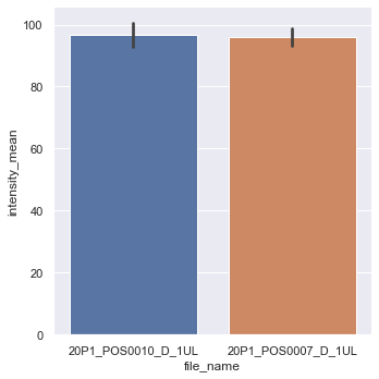
There are other kinds available, like a bar graph.
sns.catplot(data=df, x="file_name", y="intensity_mean", kind="bar")
<seaborn.axisgrid.FacetGrid at 0x14fcb408fd0>
Histograms and Distribution Plots#
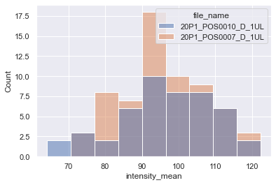
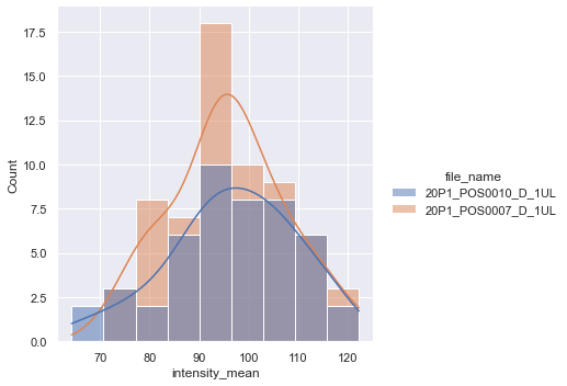
The axes-level function for plotting histograms is histplot.
sns.histplot(data = df, x="intensity_mean", hue="file_name")
<AxesSubplot:xlabel='intensity_mean', ylabel='Count'>
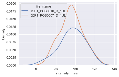
We can instead plot the kernel density estimation (kde) with kdeplot function. Just be careful while interpreting these plots (check some pitfalls here)
sns.kdeplot(data=df, x="intensity_mean", hue="file_name")
<AxesSubplot:xlabel='intensity_mean', ylabel='Density'>
The figure-level function for distributions is distplot. With it, you can have histograms and kde in the same plot, or other kinds of plots, like the empirical cumulative distribution function (ecdf).
sns.displot(data = df, x="intensity_mean", hue="file_name", kde=True)
<seaborn.axisgrid.FacetGrid at 0x27445d52d30>
Exercise#
Plot two empirical cumulative distribution functions on a same graph with different colors for the properties ‘intensity_mean’ and ‘area’.
*Hint: look for the kind parameter of displot