Plotting Data with Python
Contents
Plotting Data with Python#
Data, be it images or object features, can and must be plotted for a better understanding of their properties or relationships. We already saw that we can use napari to interactively visualize images. Sometimes, we may want to have a static view inside a notebook to consistently share with collaborators or as material in a publication.
Python has many libraries for plotting data, like matplotlib, seaborn, plotly and bokeh, to name a few. Some libraries ship plotting function inside them as a convenience. For example, you may have noticed we display some images with pyclesperanto. The cle.imshow function is an optimized plotting function, based on matplotlib, to display intensity and labeled images in notebooks. The pandas method .plot is another example, but for plotting graphs from dataframes.
Thus, in this notebook, we will explain the basics of Matplotlib, probably the most flexible and traditional library to display images and data in Python.
Knowing a bit of its syntax help understanding other higher level libraries.
import pandas as pd
import numpy as np
from skimage.io import imread
import matplotlib.pyplot as plt
Reading data#
In this notebook, we will use an image and a table to plot. Let’s read them.
The table contains continuous data from 2 images, identified by the last categorical column ‘file_name’.
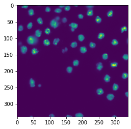
image1 = imread("../../data/BBBC007_batch/20P1_POS0010_D_1UL.tif")

df = pd.read_csv("../../data/BBBC007_analysis.csv")
df.head(5)
| Unnamed: 0 | area | intensity_mean | major_axis_length | minor_axis_length | aspect_ratio | file_name | |
|---|---|---|---|---|---|---|---|
| 0 | 0 | 139 | 96.546763 | 17.504104 | 10.292770 | 1.700621 | 20P1_POS0010_D_1UL |
| 1 | 1 | 360 | 86.613889 | 35.746808 | 14.983124 | 2.385805 | 20P1_POS0010_D_1UL |
| 2 | 2 | 43 | 91.488372 | 12.967884 | 4.351573 | 2.980045 | 20P1_POS0010_D_1UL |
| 3 | 3 | 140 | 73.742857 | 18.940508 | 10.314404 | 1.836316 | 20P1_POS0010_D_1UL |
| 4 | 4 | 144 | 89.375000 | 13.639308 | 13.458532 | 1.013432 | 20P1_POS0010_D_1UL |
Plotting an image with matplotlib#
To start, we will briefly show how to display images. You just need a single line:
plt.imshow(image1)
<matplotlib.image.AxesImage at 0x190e1a85fd0>
plt.imshow, as many other plotting functions, has optional arguments to customize the plot. Below is a brief demonstration on how to change the colormap. You can check all the options here
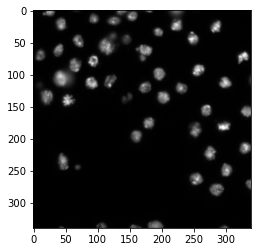
plt.imshow(image1, cmap = 'gray')
<matplotlib.image.AxesImage at 0x190e2b58df0>
Plotting a graph with matplotlib#
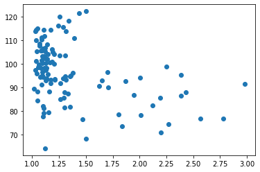
To plot a graph with matplotlib, like a scatter plot, we need to get the data from the table and feed it to plt.scatter.
Let’s plot the aspect_ratio vs mean_intensity.
x = df['aspect_ratio']
y = df['intensity_mean']

plt.scatter(x, y)
<matplotlib.collections.PathCollection at 0x190e2bd1790>
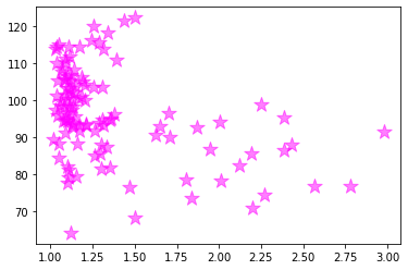
In a similar fashion, it is possible to provide extra arguments to customize plots like this. Below, we change the marker symbol, marker size (s), color and make marker half transparent (alpha).
plt.scatter(x, y, color = 'magenta', marker = '*', s = 200, alpha = 0.5)
<matplotlib.collections.PathCollection at 0x190e2c51700>
Configuring figure and axes#
Besides plotting graphs as shown above, we usually want to furhter configure the figure and its axes, like provide the names to the axes, change the figure size and maybe have more than one plot in the same figure.
To be able to do all that and more, it is necessary to have handles: variables that represent the figure and the axes objects. We can have access to them by, before plotting, creating an empty figure with the function plt.subplots.
fig, ax = plt.subplots()

fig
ax
<AxesSubplot:>
Let’s add our plot to this new figure. We now do that by passing the scatter function as an axes method.
fig, ax = plt.subplots()
ax.scatter(x, y, color = 'magenta', marker = '*', s = 200, alpha = 0.5)
<matplotlib.collections.PathCollection at 0x190e2ce0820>

OK, we got the same figure back, so what?
The difference is that now we have access to the figure handles! This adds a lot of editability.
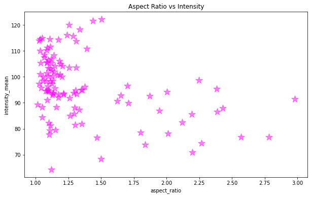
Let’s give axes proper names, put a title and increase the figure size.
Note: the default figure size is [6.4, 4.8] inches (width, height)
fig, ax = plt.subplots(figsize = [10,6])
ax.scatter(x, y, color = 'magenta', marker = '*', s = 200, alpha = 0.5)
ax.set_xlabel('aspect_ratio')
ax.set_ylabel('intensity_mean')
ax.set_title('Aspect Ratio vs Intensity')
Text(0.5, 1.0, 'Aspect Ratio vs Intensity')
Subplots#
So far we are plotting one image or graph per figure containing all the data.
We could also make a grid plot by providing the number of rows and columns of the grid to plt.subplots
fig, ax = plt.subplots(1,2, figsize = [10,6])
ax
array([<AxesSubplot:>, <AxesSubplot:>], dtype=object)
Now our axes has two elements because we specified 1 row and 2 columns.
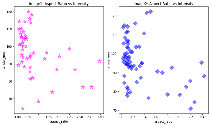
Imagine each file was a different experimental group. We can now plot the same relationship, separated by image file on different axes, but in the same figure.
First, we get data separated by ‘file_name’.
# Aspect ratio and intensity where 'file_name' equals first file name
x1 = df[df['file_name'] == '20P1_POS0010_D_1UL']['aspect_ratio']
y1 = df[df['file_name'] == '20P1_POS0010_D_1UL']['intensity_mean']

# Aspect ratio and intensity where 'file_name' equals second file name
x2 = df[df['file_name'] == '20P1_POS0007_D_1UL']['aspect_ratio']
y2 = df[df['file_name'] == '20P1_POS0007_D_1UL']['intensity_mean']
Then, specify an index to the axes to indicate which axis will get the plot.
# Get major_axis_length from table
major_axis_length = df['major_axis_length']
# Create empty figure and axes grid
fig, ax = plt.subplots(1,2, figsize = [10,6])
# Configure plot and properties of first axis
ax[0].scatter(x1, y1, color = 'magenta', marker = '*', s = 200, alpha = 0.5)
ax[0].set_xlabel('aspect_ratio')
ax[0].set_ylabel('intensity_mean')
ax[0].set_title('Image1: Aspect Ratio vs Intensity')

# Configure plot and properties of second axis
ax[1].scatter(x2, y2, color = 'blue', marker = 'D', s = 100, alpha = 0.5)
ax[1].set_xlabel('aspect_ratio')
ax[1].set_ylabel('intensity_mean')
ax[1].set_title('Image2: Aspect Ratio vs Intensity')

# Hint: this command in the end is very useful when axes labels overlap
plt.tight_layout()
Exercise 1#
The marker size can also be an array representing another property, like area. Plot the graphs above again by providing the area to the s parameter and check the results.
area1 = df[df['file_name'] == '20P1_POS0010_D_1UL']['area']

area2 = df[df['file_name'] == '20P1_POS0007_D_1UL']['area']
Exercise 2#
Here is the second image:
image2 = imread("../../data/BBBC007_batch/20P1_POS0007_D_1UL.tif")
Display each image and each graph in a single figure, with images on the first row, and graphs on the second row.