Scatter Artist#
In this example notebook, we show how to create a scatter plot using the Scatter class. The Scatter class is a subclass of the Artist class.
It has a simplified interface for creating scatter plots and updating some of its properties, like assigning different classes to points and displaying them with different colors based on a categorical colormap.
It can be imported like shown below:
import numpy as np
import matplotlib.pyplot as plt
from biaplotter.artists import Scatter
from nap_plot_tools.cmap import cat10_mod_cmap
Creating a Scatter Plot#
To create an empty scatter plot, just instanciate the Scatter class and provide an axes object as an argument.
fig, ax = plt.subplots()
scatter = Scatter(ax)
Adding Data to the Scatter Artist#
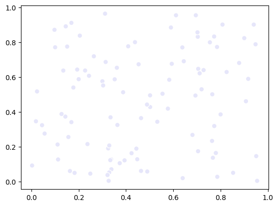
To add data to the scatter plot, just feed the property data with a (N, 2) shaped numpy array. The plot gets updated automatically every time one of its properties is changed.
n_samples = 100
data = np.random.rand(n_samples, 2)
scatter.data = data
fig # show the updated figure
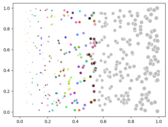
Assigning Classes to Data Points#
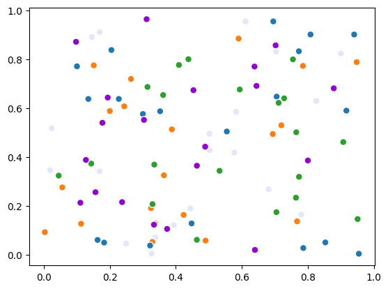
The Scatter artist comes with a custom categorical colormap, which can be used to assign different classes to points.
You can access the scatter current categorical colormap via its overlay_colormap attribute.
scatter.overlay_colormap

To assign classes to points, just feed the property color_indices with a (N,) shaped numpy array containing integers. These integers will be used as indices to the colormap.
Below, we randomly color the points with the 5 first colors of the scatter default colormap (light gray is the default color with color index 0).
color_indices = np.linspace(start=0, stop=5, num=n_samples, endpoint=False, dtype=int)
scatter.color_indices = color_indices
fig
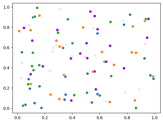
Changing the data - i.e., adding new data of the same size will keep the point properties (e.g., the color_indices) as they are:
data = np.random.rand(n_samples, 2)
scatter.data = data
fig
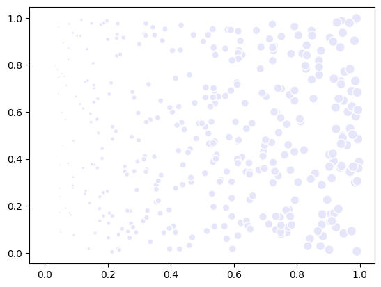
Adding new data of a different size resets the coloring:
# Adding 400 more samples
n_samples = 400
data = np.random.rand(n_samples, 2)
scatter.data = data
fig
Setting point properties#
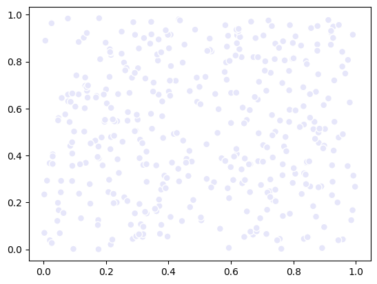
You can also set other properties of the points, like their transparency. This is mediated through the alpha property. In this case, we set the transparency of the points according to the respective point’s x coordinate, so we should observe a transparency gradient from left to right.
alpha = data[:, 0]
alpha = (alpha - alpha.min()) / (alpha.max() - alpha.min())
scatter.alpha = alpha
fig
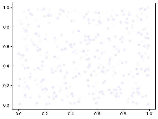
Again, changing the data will keep the point properties as they are:
data = np.random.rand(n_samples, 2)
scatter.data = data
fig
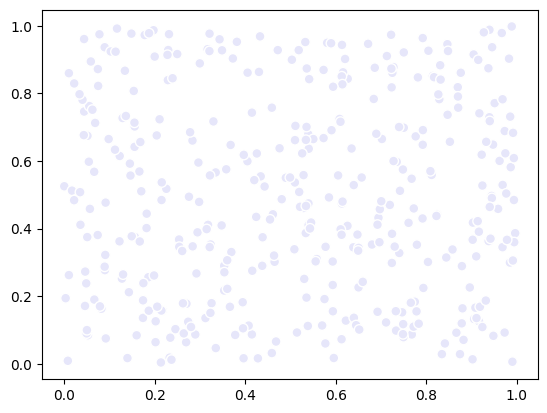
You can undo this by simply setting all alpha values to 1:
scatter.alpha = 1
fig
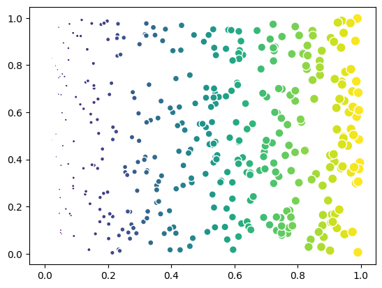
You can also set the sizes of the points (values around ~50 are typically a good starting point):
size = data[:, 0] * 100
scatter.size = size
fig
If you change to a continuous overlay_colormap, you can use the color_indices property to represent a feature of the data with colors, like the size example above.
scatter.overlay_colormap = plt.cm.viridis
scatter.color_indices = size
fig
Scatter Color Normalization#
The Scatter class also provides different color normalization options. This is useful when you have a continuous feature that has a non-linear distribution.
feature = np.exp(10*data[:, 0])
We first show the feature colored in a ‘linear’ scale (default).
scatter.color_indices = feature
fig
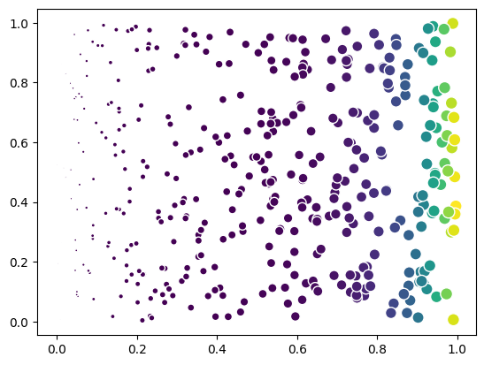
Most of the points are colored in the same color, because the feature has a non-linear distribution.
Then, we normalize the color indices using the ‘log’ scale. The points are now colored in a more balanced way.
scatter.color_normalization_method = 'log'
fig
C:\Users\mazo260d\Documents\GitHub\biaplotter\src\biaplotter\artists_base.py:248: UserWarning: Log normalization applied to color indices with min value 1.0058329223650035. Values below 0.01 were set to 0.01.
  warnings.warn(
Of course this only makes sense if the colormap is continuous and the color_indices represent a feature. If we set the colormap back to categorical, the normalization is set back to ‘linear’ and you should replace the color_indices back the class numbers.
scatter.overlay_colormap = cat10_mod_cmap
fig
C:\Users\mazo260d\Documents\GitHub\biaplotter\src\biaplotter\colormap.py:34: UserWarning: Categorical colormap detected. Setting categorical=True. If the colormap is continuous, set categorical=False explicitly.
  warnings.warn(
C:\Users\mazo260d\Documents\GitHub\biaplotter\src\biaplotter\artists.py:144: UserWarning: Color indices must be integers for categorical colormap. Change `overlay_colormap` to a continuous colormap or set `color_indices` to integers.
  warnings.warn(
C:\Users\mazo260d\Documents\GitHub\biaplotter\src\biaplotter\artists.py:148: UserWarning: Categorical colormap detected. Setting color normalization method to linear.
  warnings.warn(
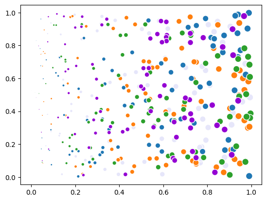
color_indices = np.linspace(start=0, stop=5, num=len(data), endpoint=False, dtype=int)
scatter.color_indices = color_indices
fig
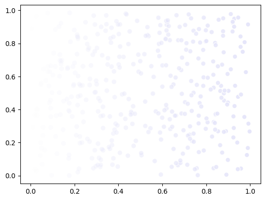
Scatter Visibility#
Optionally, hide/show the artist by setting the visible attribute.
scatter.visible = False
fig
scatter.visible = True
fig
Resetting the Scatter Artist#
The Scatter artist can be reset to its default state by calling the reset() method. This will remove all data and properties set on the artist, and it will be ready to accept new data.
scatter.reset()
fig